


This example of a dry-to-wet gradient is, in its own way, as dramatic as the one I shared in my recent post on the Lomas de Lachay in Peru. The dry end here isn’t a barren desert as it is there, but the wet end is much wetter—in fact, too wet for native trees to grow.

San Cristóbal Island from the boat.
San Cristóbal Island in the Galápagos is one of the archipelago’s four inhabited islands and one of those that are large and high enough to support moist highland zones above the arid lowlands. The precipitation comes largely from fog rather than rainfall, essentially the same fog that feeds the lomas formations on the mainland. The cold Humboldt Current, which flows up the coasts of Chile and Peru and then heads westward past the Galápagos, is a chief factor responsible for the fog and low rainfall in that entire region. On the mainland though its effect is amplified by other conditions (related to latitude and topography) that reduce rainfall to nearly zero along the coast; the “desert” lowlands of the Galapagos look lush in comparison, and the highlands do receive enough actual rainfall, in addition to the fog drip, to support forests as opposed to the “wet savannas” of the lomas. But above those forests, as I said earlier, precipitation is high enough that no native trees have evolved to survive, resulting in a shrubby or boggy landscape which at the highest elevations (the “fern-sedge” zone) is somewhat reminiscent of the moors of the United Kingdom.

Cacti and lava rock in the lowlands of San Cristóbal.

Another view of the lowland arid zone, notably with the vegetation in leaf (this scene would typically be grey/brown for half the year).

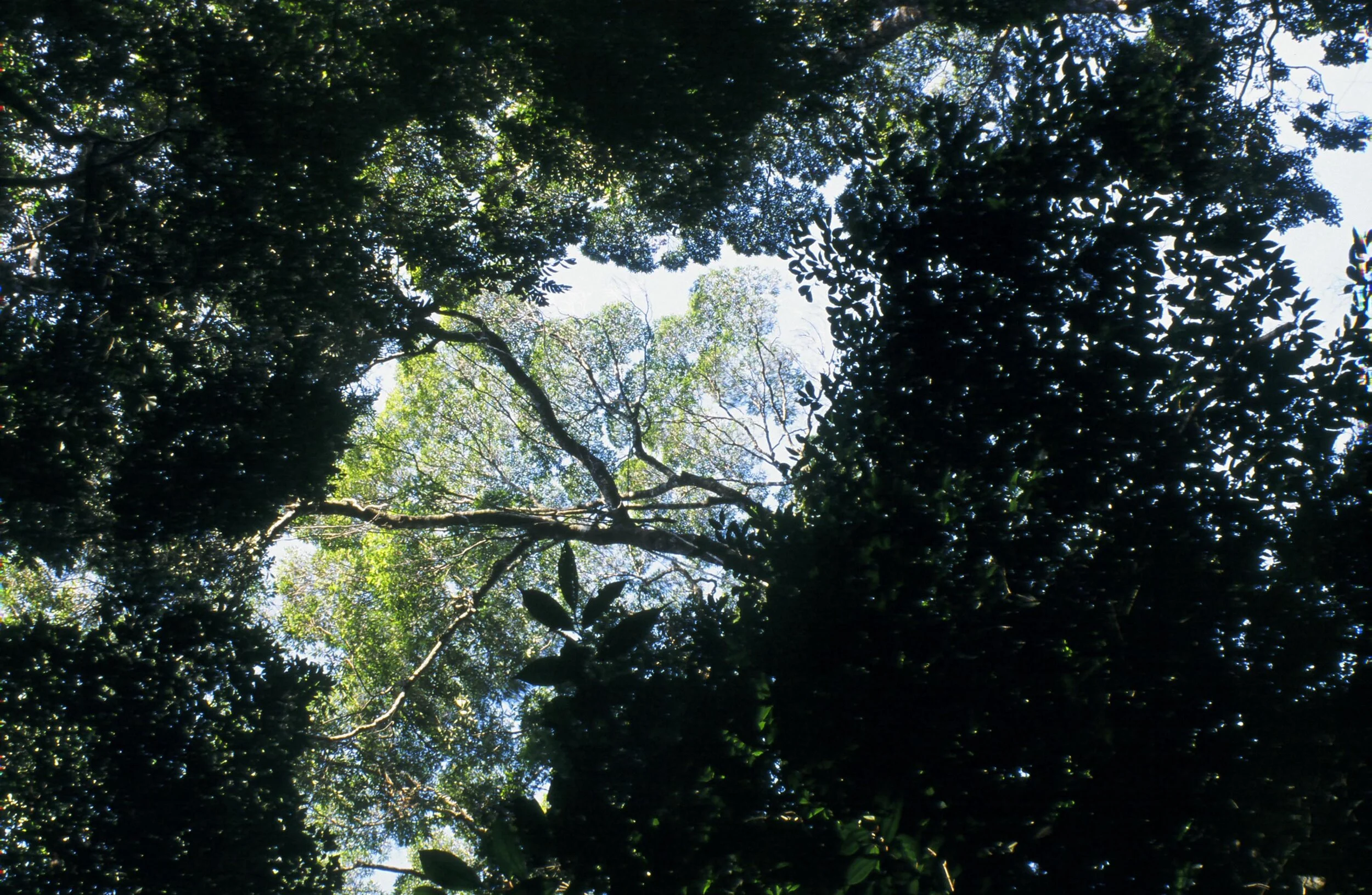
Miconia shrubland in the treeless highland zone, on the hike up to El Junco lagoon.

The misty shores of El Junco.
But as I wrote in my previous post on nearby Santa Cruz Island, these wet highland environments are critically endangered. On San Cristóbal the native highland forests, composed of trees of the genus Scalesia in the daisy family, have been completely eradicated by agriculture and grazing (though there are reports of a few trees clinging to an inaccessible cliff face somewhere). Of the treeless zones above that few pockets remain, and those have also been degraded by cattle and invasive grasses filtering in from adjacent pastures. One of these pockets (or possibly the only one, at least that’s accessible) exists around El Junco lagoon, a crater lake containing the archipelago’s only source of fresh water. It’s not the island’s highest point but at 700m it’s close to it—though that elevation seems like nothing considering its dramatically different climate from the coastline.

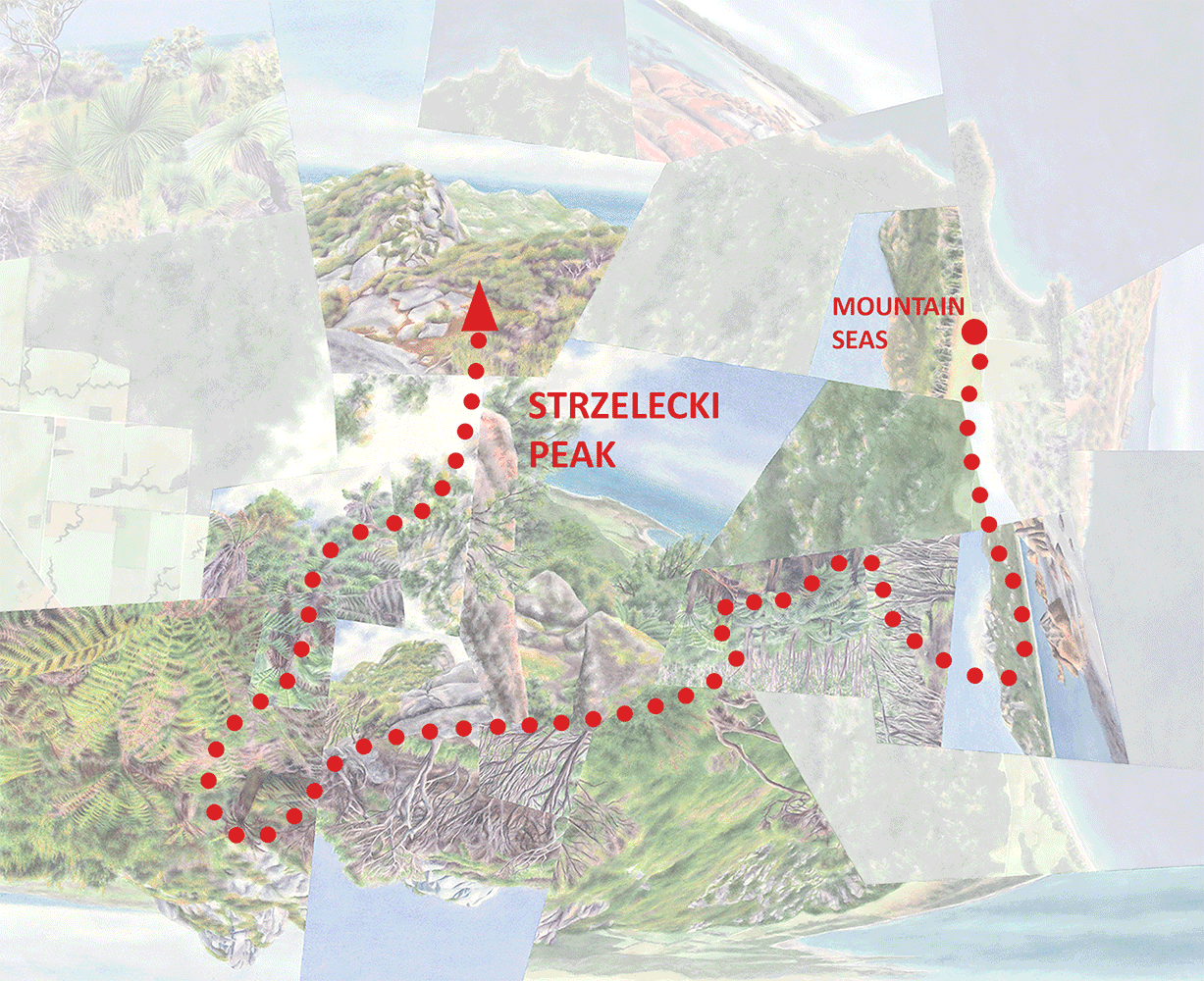
Aerial view of San Cristóbal with the route(s) of travel depicted in the worldview below. Except for the segment north of Puerto Baquerizo Moreno (the main town and the provincial capital) and the loop around El Junco, which are hiking trails, the route consists of the island’s only long-distance road, about 25km long. The oval-shaped area of darker green identifies the wetter highlands, which might stand out more against the lowlands if the image had been taken a different time of the year. This view includes about half of the island, containing the entire highland zone. (Satellite image from Google Maps.)
Since the native forest in-between has been replaced by agricultural/grazing land, the half-hour drive from well-preserved arid lowlands to comparatively intact, saturated highlands (and then back down to arid) along the main road doesn’t represent an ideal ecological gradient. But, the dry-to-wet transition is still obvious and surreal, and it inspired the worldview below.

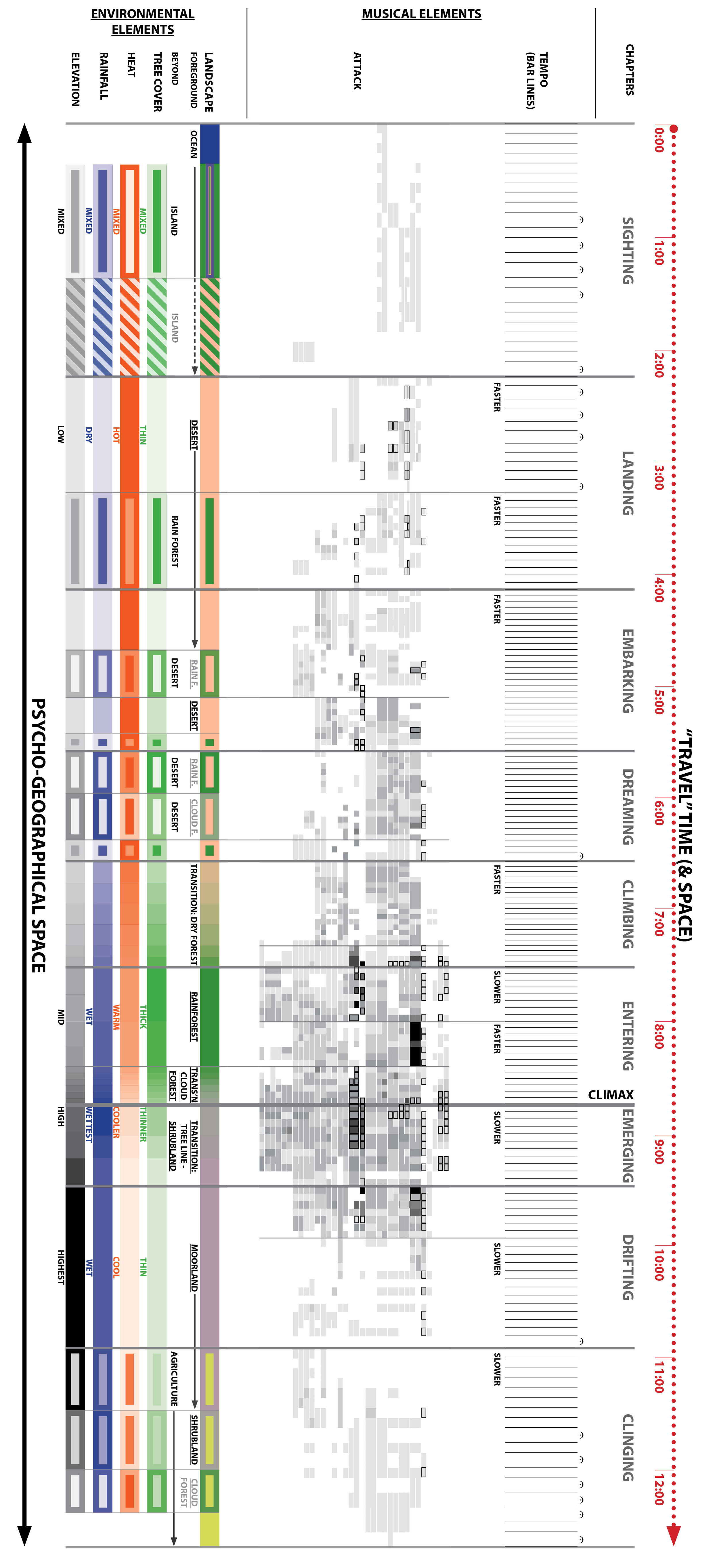
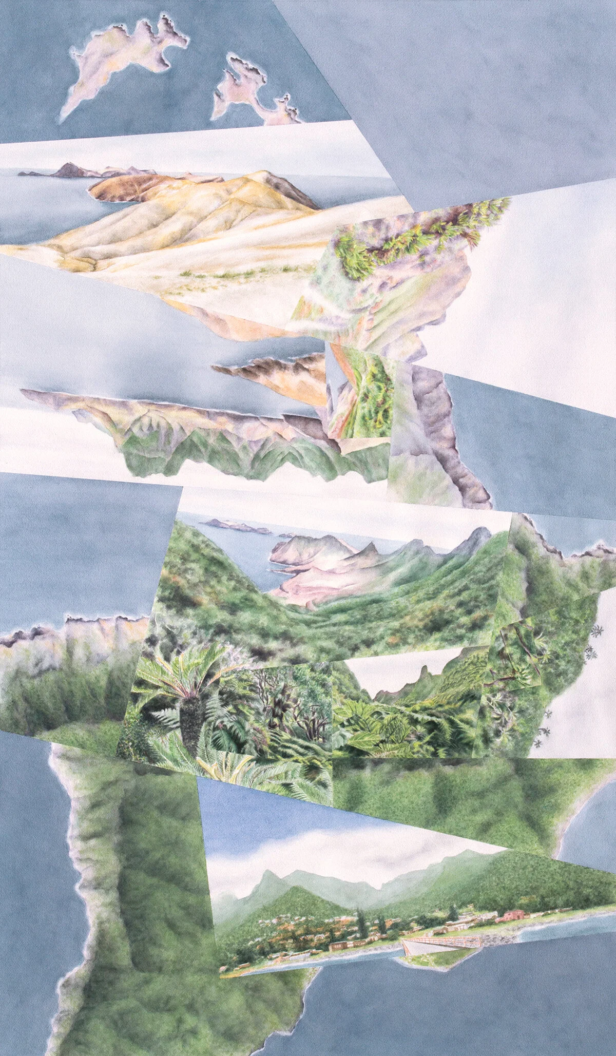
Highlands, watercolor on aquabord, 24”x36.” As mentioned above the arid zone looked relatively lush when I was there, so except where I could incorporate cacti it was a challenge to make a clear distinction between the lowlands and highlands while staying relatively true to the experience. I ended up playing up the browns and purples in the arid scenes and using more yellowish greens (mostly to suggest stronger sunlight).
This work depicts something between what I’ve been calling a “wandering” (lacking a clear, linear path of travel) and a “journey” (based on such a path) because that 25km trip actually cobbled together multiple trips and detours—both the yellow path above and the abstracted red path below are simplifications. Plus you’ll see the abstracted version is messy to diagram since portions of it extend beyond the frame. My main reason for diagramming it anyways is to illustrate, compared to the actual route on the aerial photo, how much I’ve distorted the overall shape and length in order to emphasize the parts of the experience that made the strongest impression, namely the highland zone around El Junco. This area felt like the destination or “resting point”—a special, mist-shrouded world unto itself—even though the trip actually continued on to the opposite coastline.

An animated journey through Highlands, along an abstraction of the actual (yellow) route. It begins as a hike through the semi-desert from Muelle Tijeretas (a diving site) to the main town of Puerto Baquerizo Moreno, where it picks up the road, rises into the cultivated highlands and passes through the village of El Progreso (mostly hidden beneath the clouds in the aerial fragment). The road emerges into the treeless highlands, where the trip follows a roughly one-hour hike up to and around El Junco lagoon. Returning to the road, the journey runs downhill back into the arid lowlands, ending at the beach at Puerto Chino.
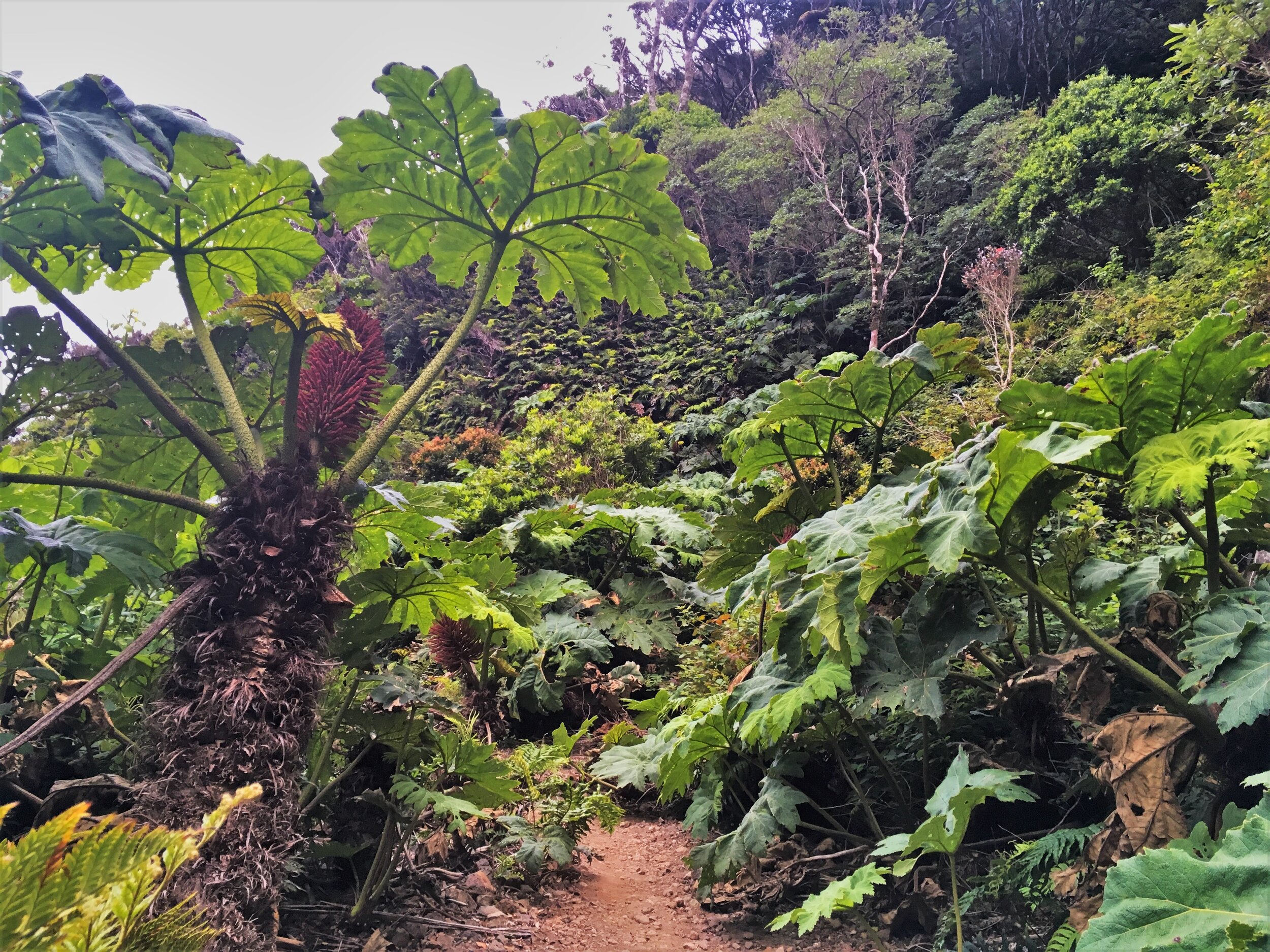
Another aspect of the experience that I found inspirational, besides the precipitation gradient, relates to the juxtaposition of natural and manmade landscapes. In this case though, unlike the urban-wild edges that I’ve focused on in other works, it wasn’t a sharp juxtaposition that inspired me but rather a much softer form of proximity that had the same empowering effect. As I’ve said before I find sharp edges between natural and developed landscapes empowering because the former is “wild” but at same time “humanized” by virtue of being both small and isolated. In this case though, while that small-and-isolated condition definitely applies, it’s not easy to perceive since both landscapes are treeless—the island of native landscape has no clear boundary. That sense of humanization is a result not of constriction but of “integration”—the native landscape is merged into the non-native one while still maintaining its identity as “native.” I’m using quotes there because again that nativeness is relative; invading grasses and probably cattle browsing and trampling have turned significant areas of the original shrubland into something a lot more pasture-like, which definitely plays a role in the blurring of the boundary. (So does the persistent mist.) But given the naturally treeless nature of that landscape combined with some degree of denial, I could still tell myself that it represented something special and generally intact.
This is a pretty nuanced perspective (though maybe not much more than my usual take on things) that’s complicated not only to put into words but to convey in paint. I tried though, particularly in the center-bottom fragment which depicts the ferny rim of the lagoon in the foreground grading into pasture below and beyond. That scene didn’t come from one particular photograph, since no single one captures the impression of ambiguity that I’ve described. But the four below, all shot within that fuzzy boundary zone, taken together should give some sense of it.


The fact that I was moved by this ambiguity is an example of the tension I express in most of my works incorporating human-dominated landscapes, between the alternately empowering and destructive aspects of environmental manipulation. But since in this case that manipulation doesn’t involve sharp edges, my guess is that neither of those aspects comes out very strongly in the work—outwardly at least, the composition is more about the precipitation gradient. And from that perspective I certainly wish the only treeless landscapes on the island were the ones that evolved that way.
Darren


