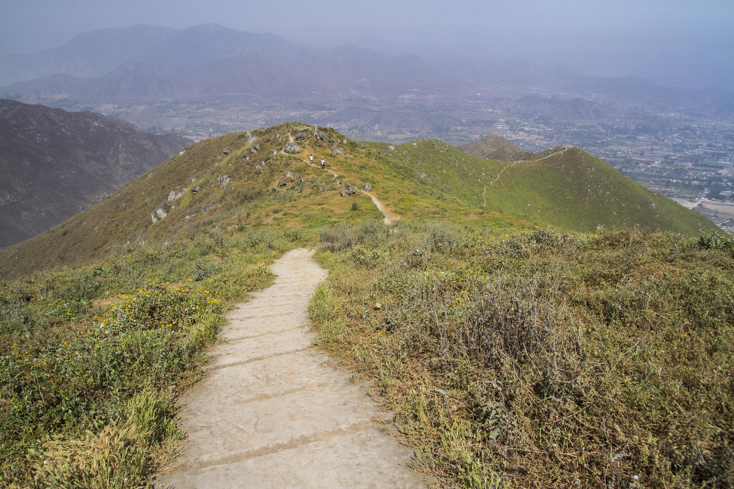
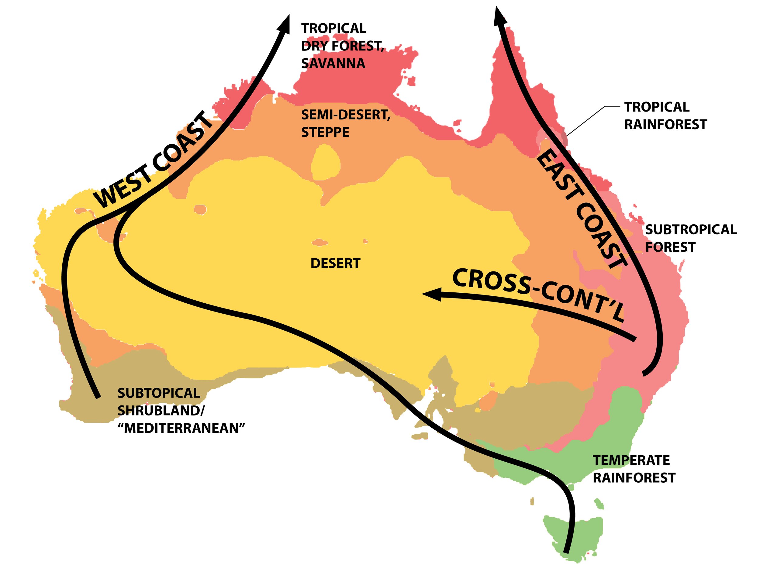
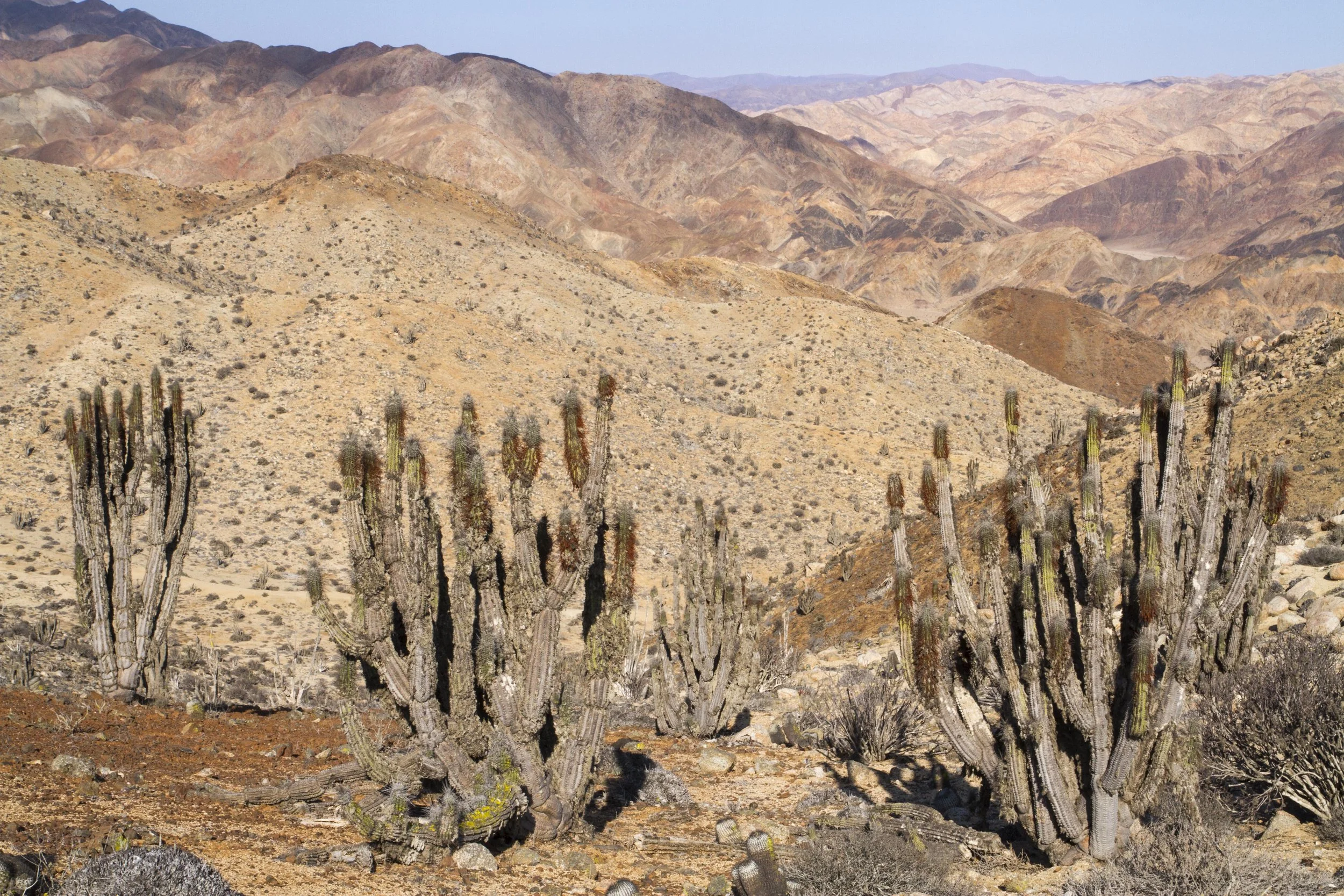
First, at those desert latitudes, the Andes form a high and continuous wall and the prevailing winds are from the east, creating an especially strong rain shadow effect. Second, the subtropical high-pressure zone typically centered around 30 degrees has its usual drying effect, except that for complicated reasons again having to do with the Andes it’s more stable and extends farther north than along other west coasts. And finally, and probably most importantly, the cold Humboldt/Peru Current cools and dries the air all the way to Ecuador where the coastline starts to bend eastward away from the current. (Once again I’m drawing on my new favorite book, Trewartha’s The Earth’s Problem Climates, for most of this background.)
The absolute dryness of those deserts of course produces a heightened contrast with the wet climates to the north and south. But the northward extension of the dry zone (mostly due to the cold current) also means that on the northern side that contrast is compressed, so that the coastline between Southern Ecuador and central Colombia features the world’s sharpest rainfall gradient at sea level. You can see that to a degree in the maps above but I think it’s complex and interesting enough to deserve its own post—stay tuned for that.
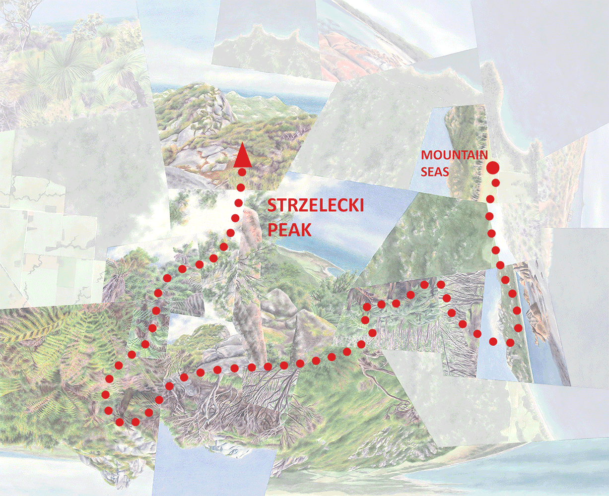
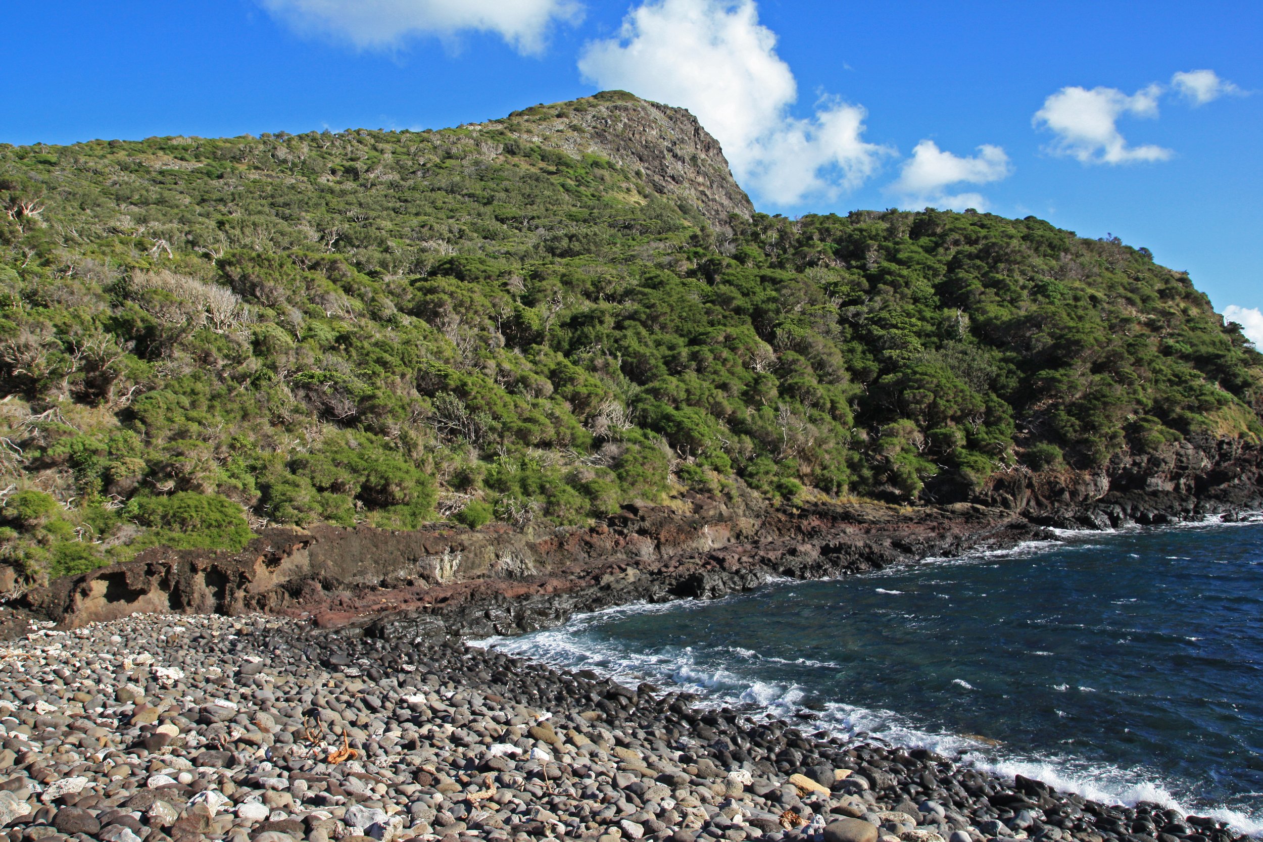
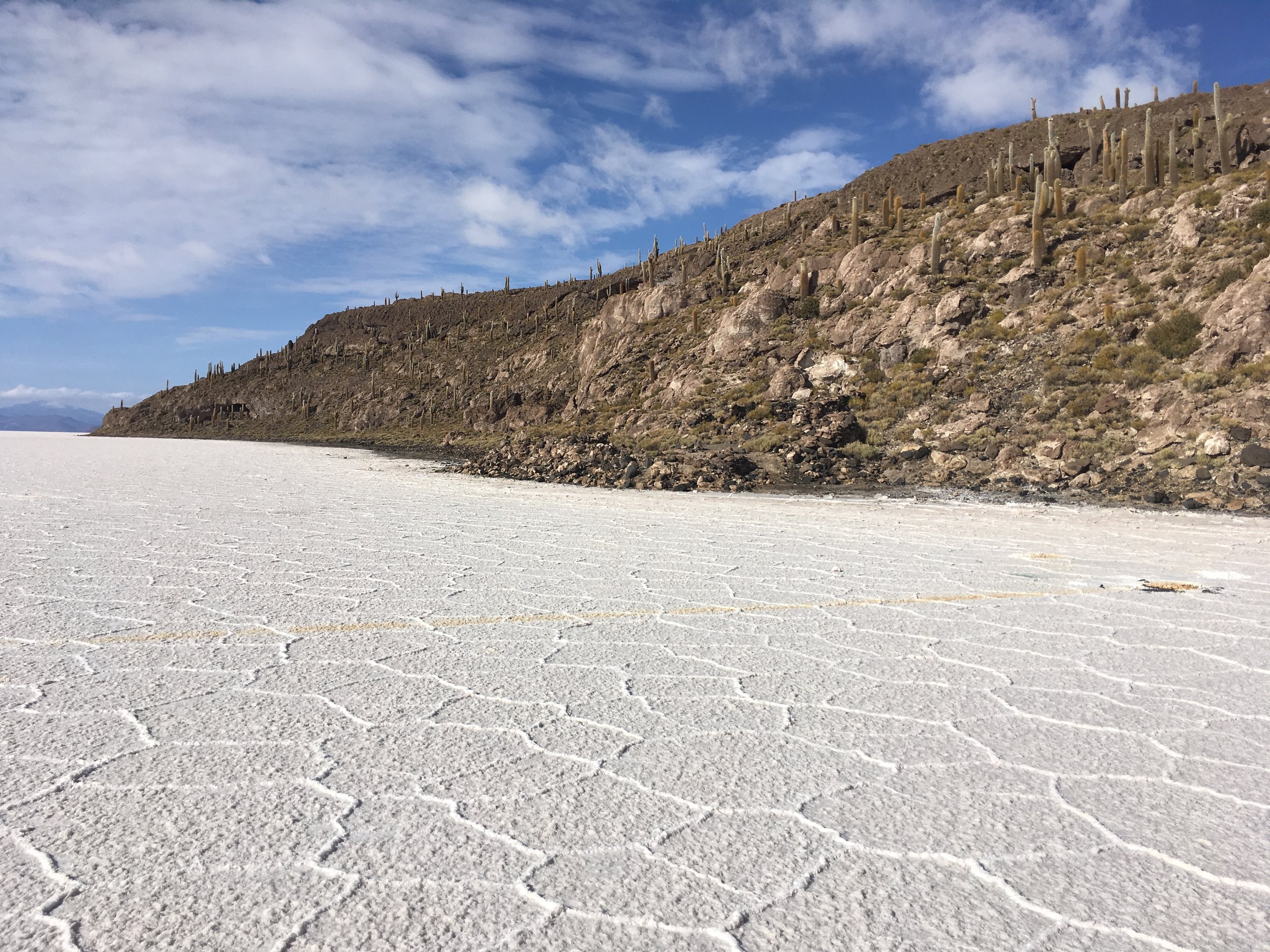
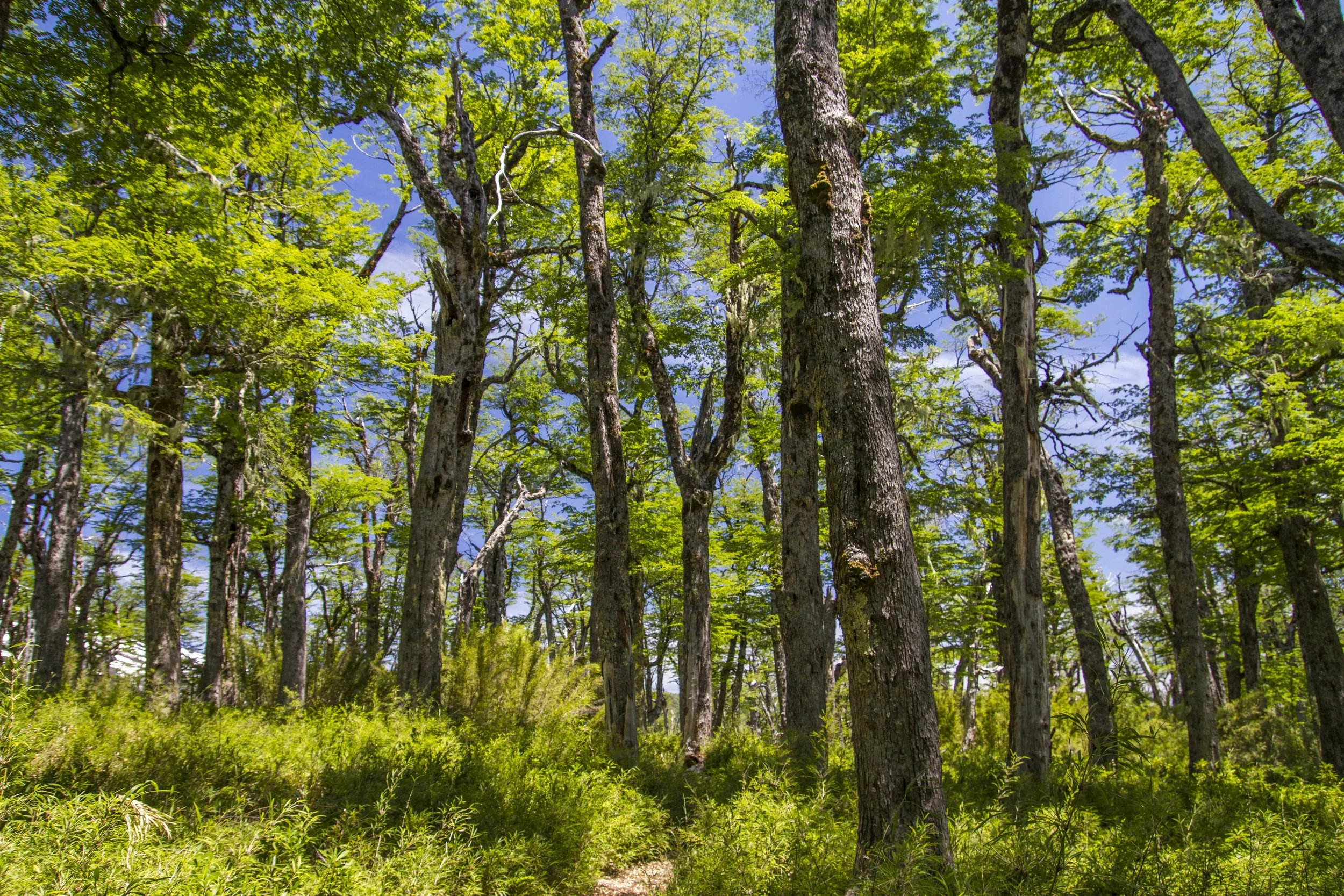
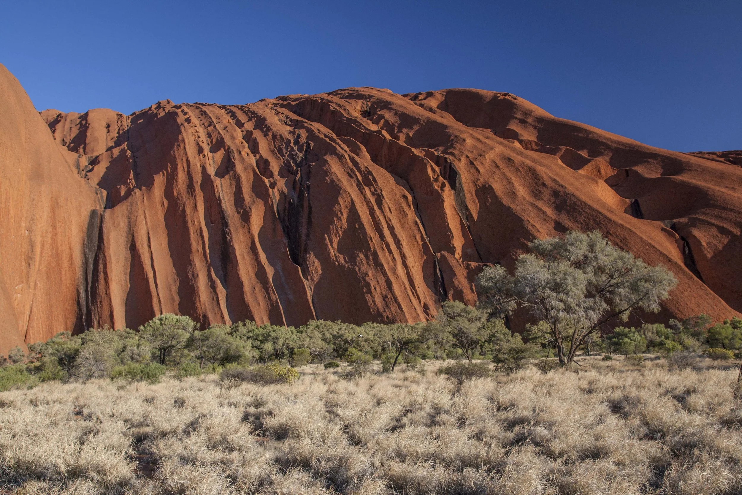
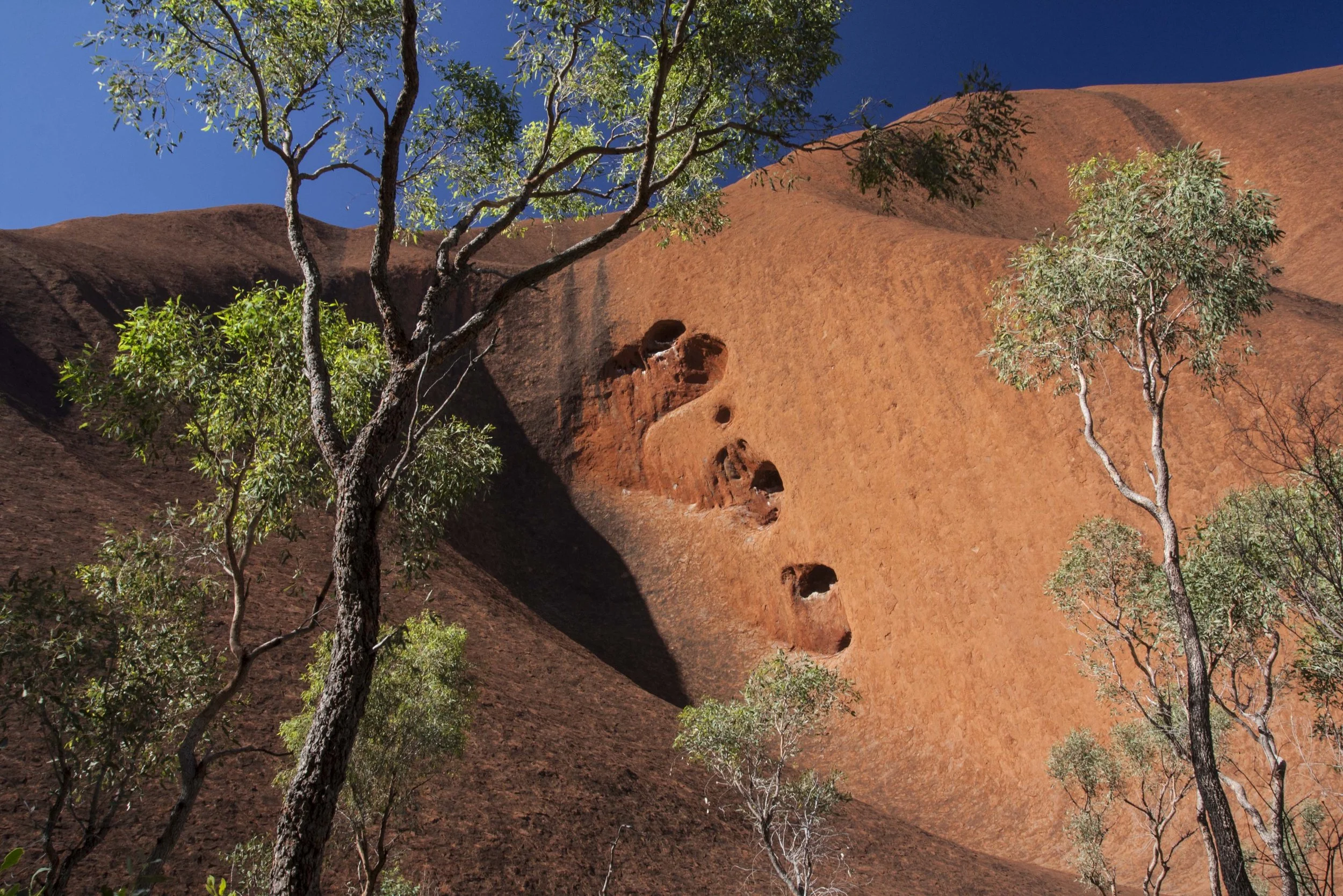
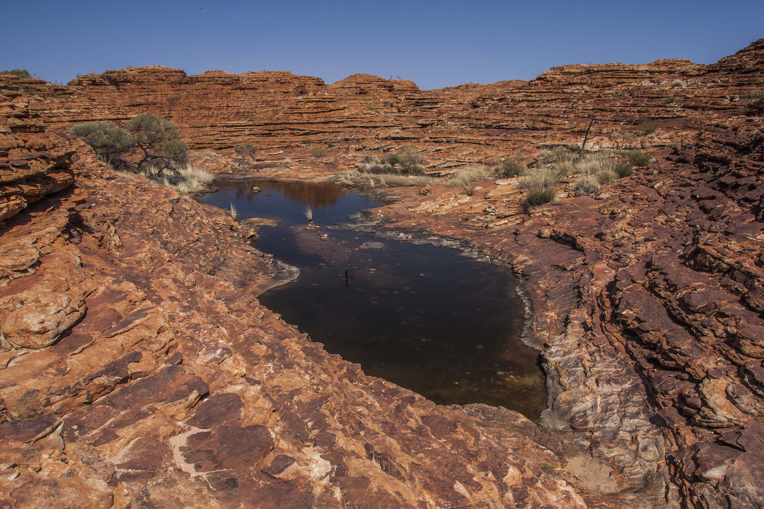
In this post I’ll focus on the southern part of the pattern, from the Atacama Desert on the Peru-Chile border south to the temperate rainforests of Chiloé Island and the Carretera Austral (Chile’s southernmost coastal “highway”) in northern Patagonia. To go all the way to the southern tip of the continent by road would’ve required driving into Argentina, through higher and drier landscapes, in order to bypass the rugged intervening coastline. (Someday, though, it would still be nice to make a separate visit to that extreme.)
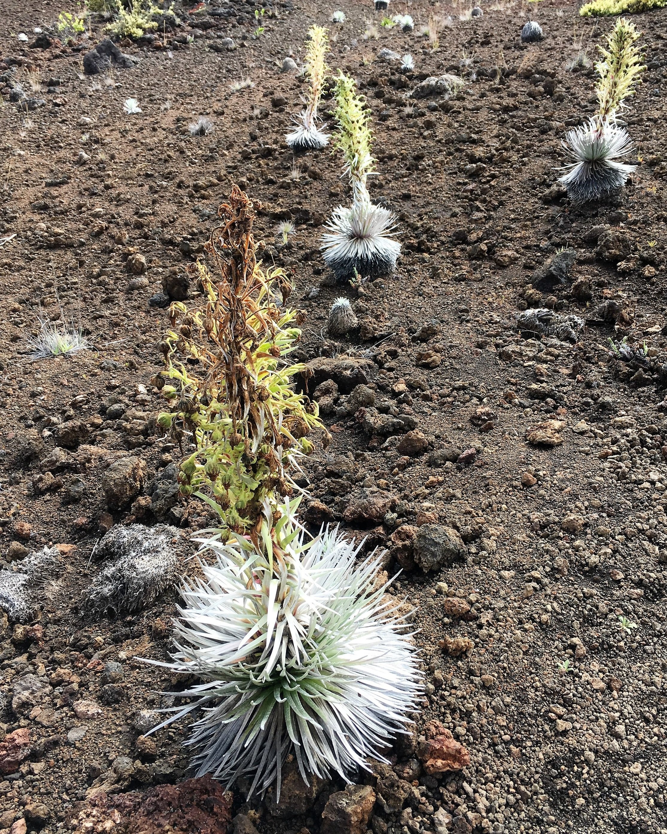
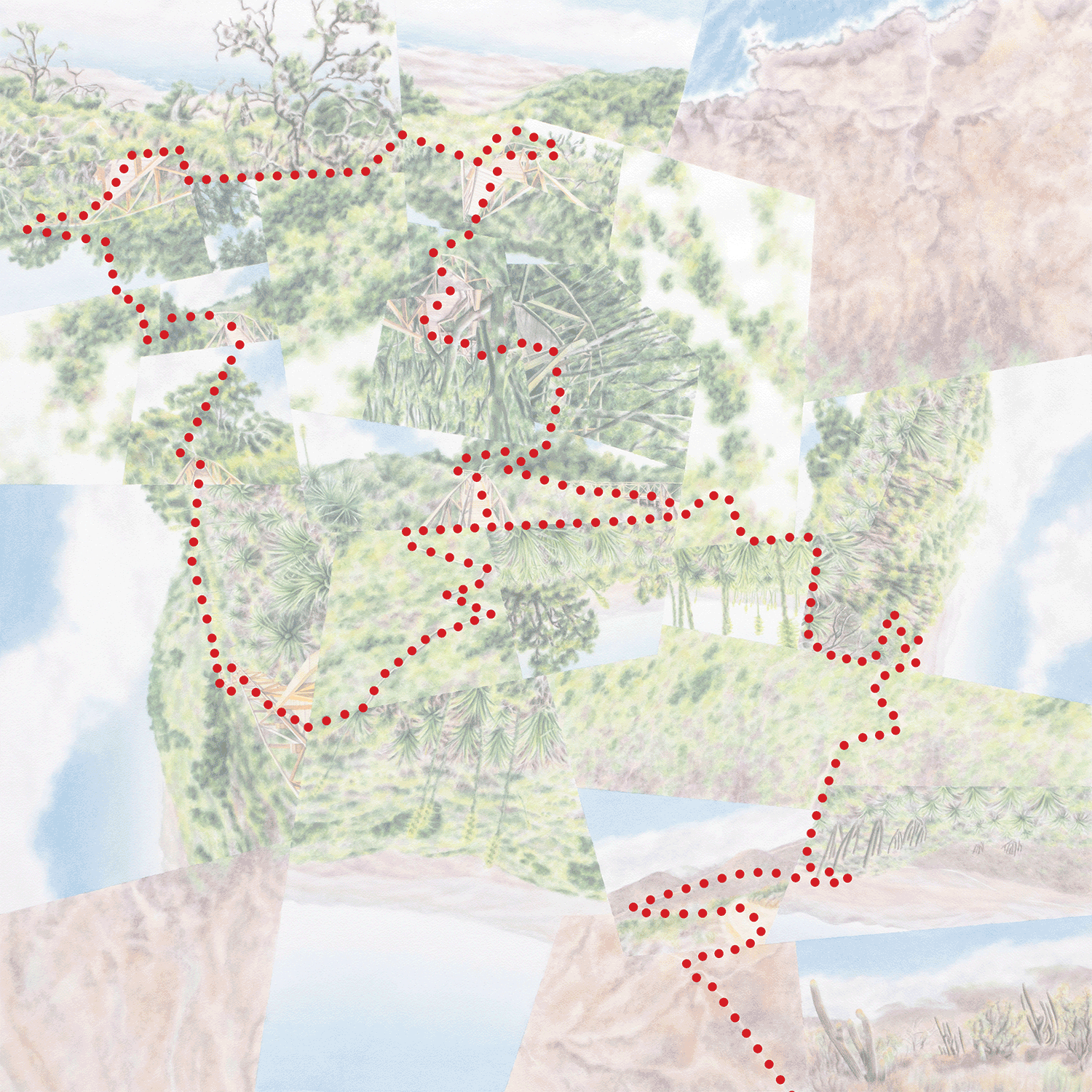
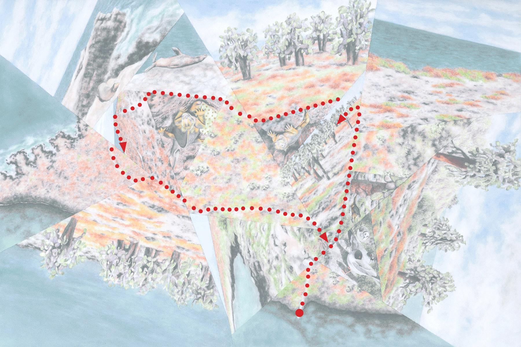
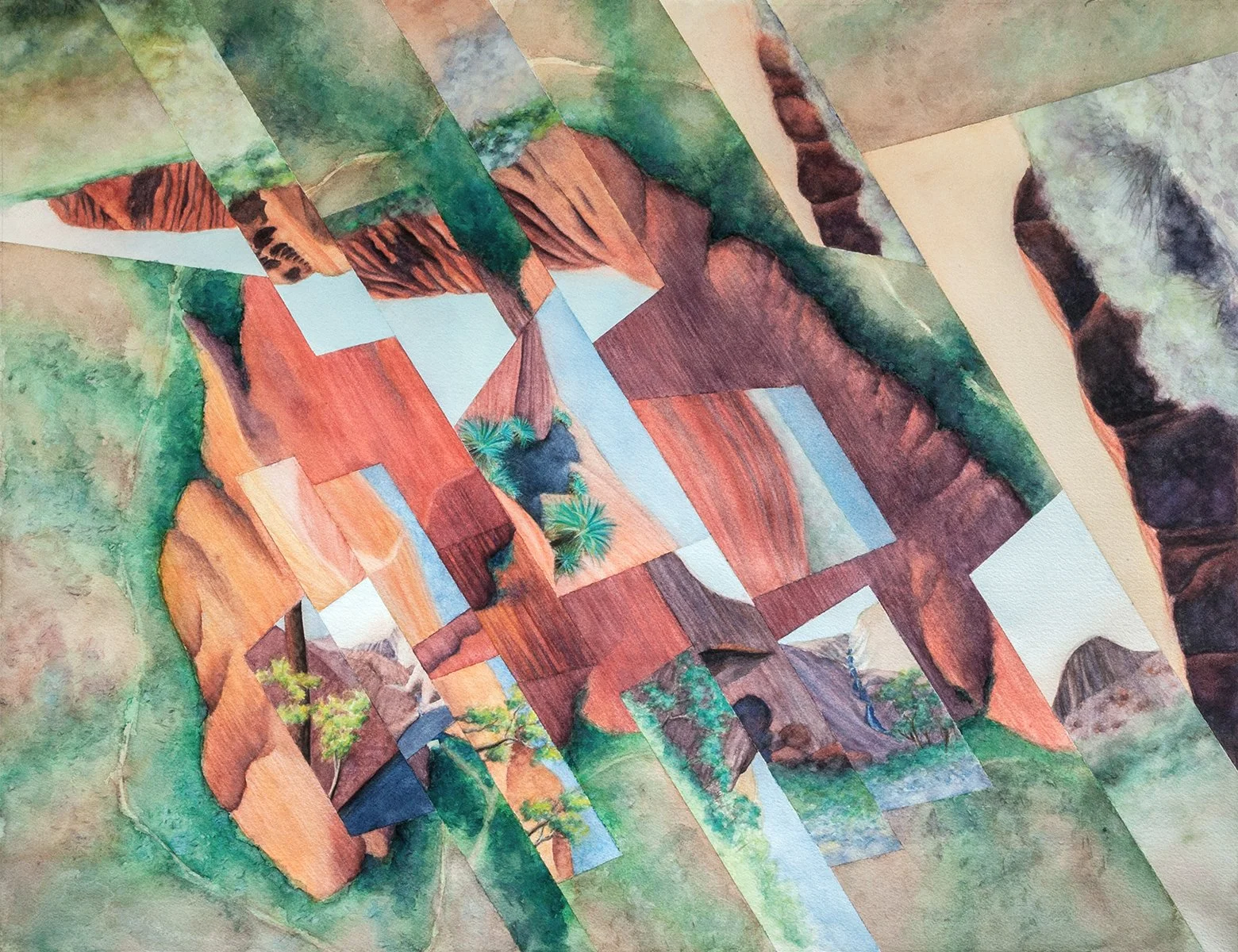
I made the 3700 km./2300 mi. journey (in fall 2019) by a combination of bus, car and ferry, with the exception of one air travel segment. My goal was to experience and photograph enough reasonably intact landscapes, at roughly even intervals along the route, to later be able to create either 1) a photographic transect of the gradient with only slight variation from one image to the next or 2) one of my fractured watercolor representations.
But as I mentioned in my “Long Gradients” series of posts, I’ve since realized that the fractured/abstract style doesn’t lend itself well to this scale and “linearity.” And even though I knew that having limited flexibility on the trip (for a few reasons I didn’t want to do the whole thing by rental car) would mean any attempt at the photographic transect would be superficial, it became even clearer that the concept can’t really work without using an interval less than, say, fifty miles. Particularly in such a topographically complicated region, where it’s hard to eliminate local variations to the large-scale climatic patterns without choosing the route very carefully, fewer images means less flattening out of those variations.


