Rock

Happy New Year everyone! Despite the covid situation my Italy trip earlier this month (International Cartographic Conference in Florence plus some volcano-focused sightseeing in Naples) ended up going smoothly—more on that in my next Newsletter! For this post I’m going to wrap up the current Australia tour with a work inspired (mostly) by a place that’s a bit more well-known than the others I’ve described—Uluru, formerly known as Ayers Rock. It’s actually one of my earliest “fractured” works in watercolor, completed soon after my 2017 Australia travels. But, I think it’s interesting to re-visit now since it represents a special case of my earlier inclination to mix and match fragments of widely separated places in the same composition, in order to enhance a place that I feel is incomplete on its own.

Sunset view of the red sandstone monolith Uluru in grassland in the Northern Territory, Australia

Uluru at sunset.

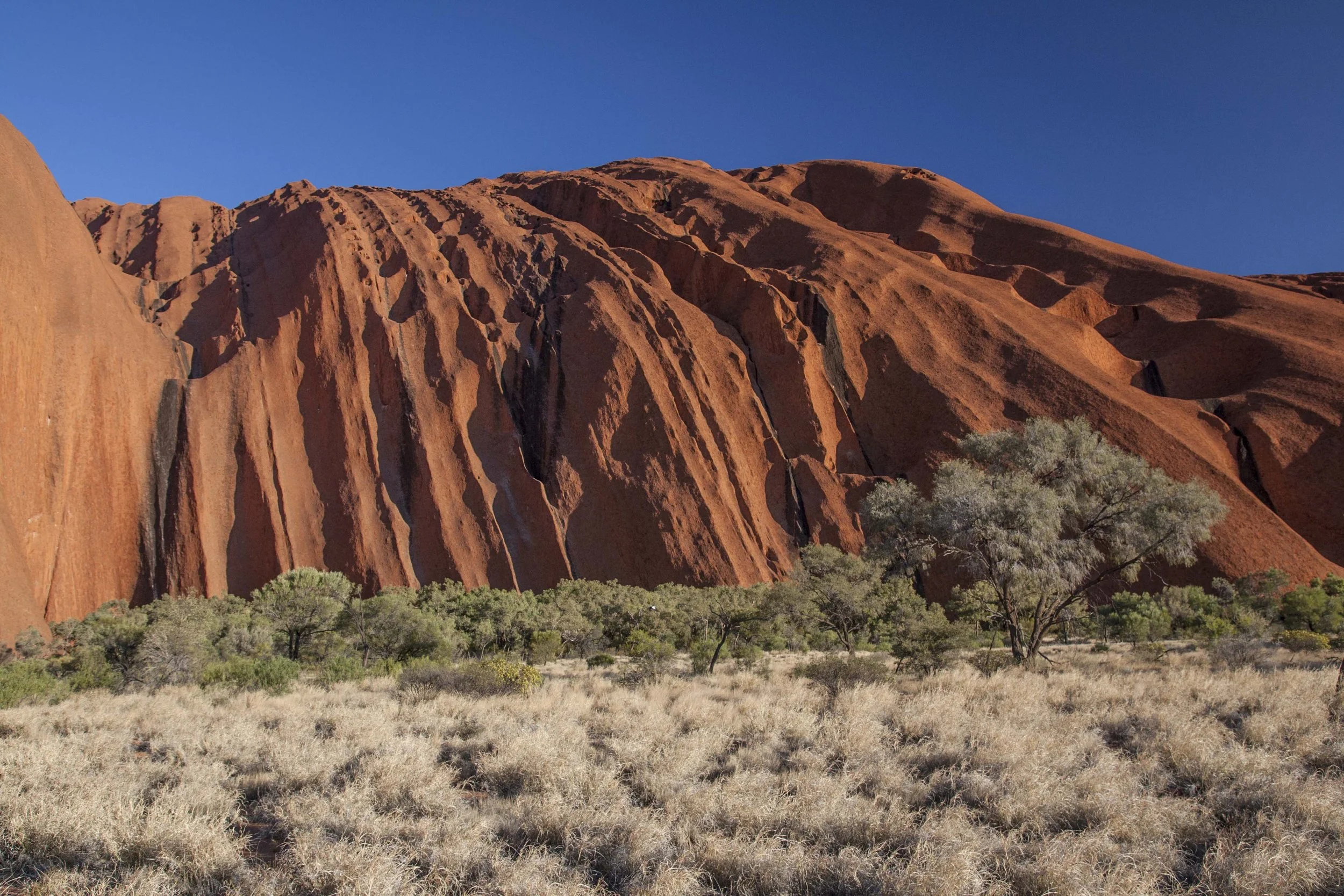
Uluru’s located in the Northern Territory, in what’s called the “Red Centre” of Australia for obvious reasons. Contrary to popular conception the region isn’t a desert but more like a mosaic of arid grassland and shrubland; around the perimeter of the rock, where runoff collects, there are patches of forest. The rock itself is a sandstone monolith that, incredibly, is actually turned on its head—it’s several times taller (deeper underground) than it is wide. There are some tiny pockets of vegetation, including a tree or two, around temporary pools on the surface but it’s essentially bare rock.

Close-up view of the grooved red sandstone of Uluru, with forest and grassland at the base, in the Northern Territory, Australia

Close-up of the rock, with forest at the base.

Close-up view of the red sandstone wall of Uluru, with shrubland at the base, in the Northern Territory, Australia

Another, more vertical section of the monolith wall.

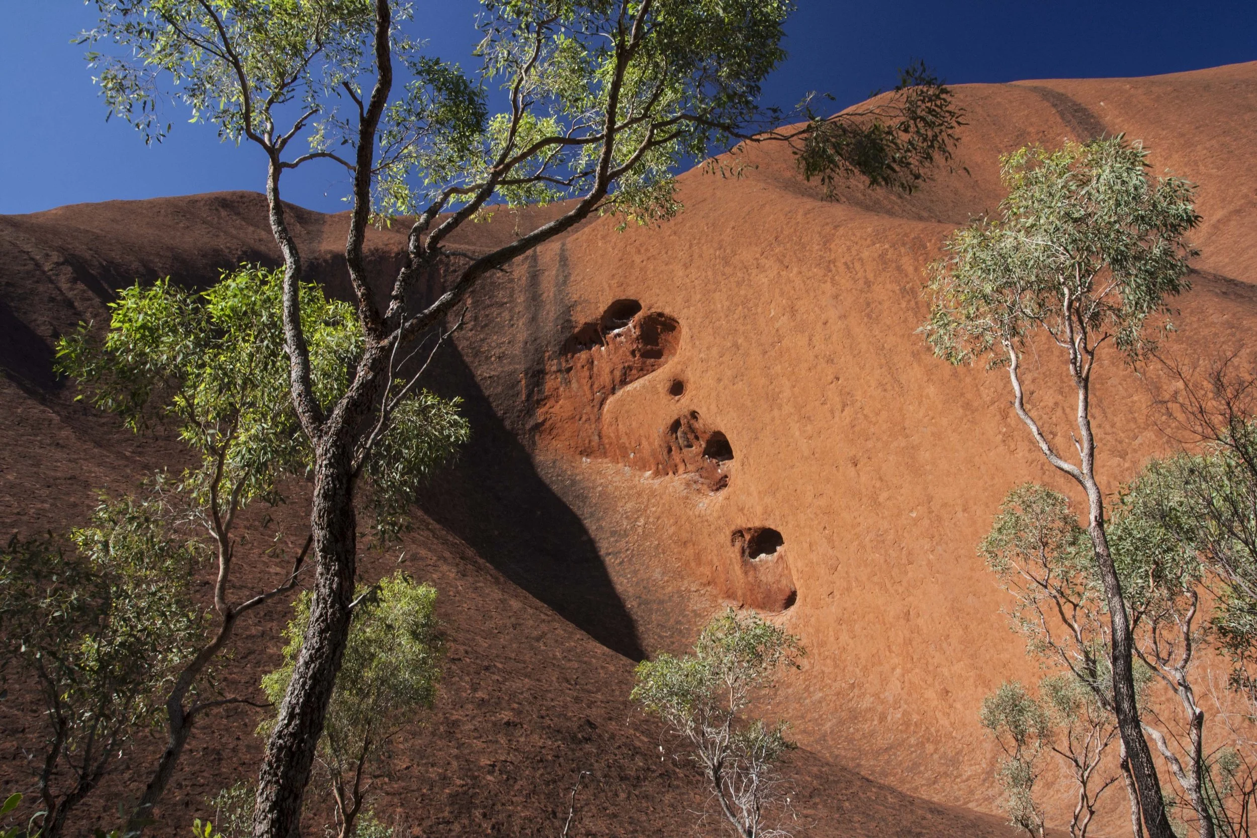
View of eucalyptus trees and smooth red sandstone of Uluru in the Northern Territory, Australia

Eucalyptus and sandstone.

Most of my visit consisted of a 10km walk around the base (I was pleasantly surprised to find a package tour that included it). Until it became prohibited just a few weeks after I was there, it was also possible to climb the rock, though strongly discouraged. The traditional owners of the land (the Anangu, to whom the site was handed back in 1985) considered it disrespectful to a sacred place; it also polluted runoff that supports wildlife around the base of the rock. Plus it was dangerous—a chain guided climbers up the steepest part, but there were still many accidents as well as plenty of heat- and exertion-related problems. I gladly took these as reasons not to do it, given how much I was trying to cram into that trip; otherwise I definitely would’ve succumbed to a fear-of-missing-out.

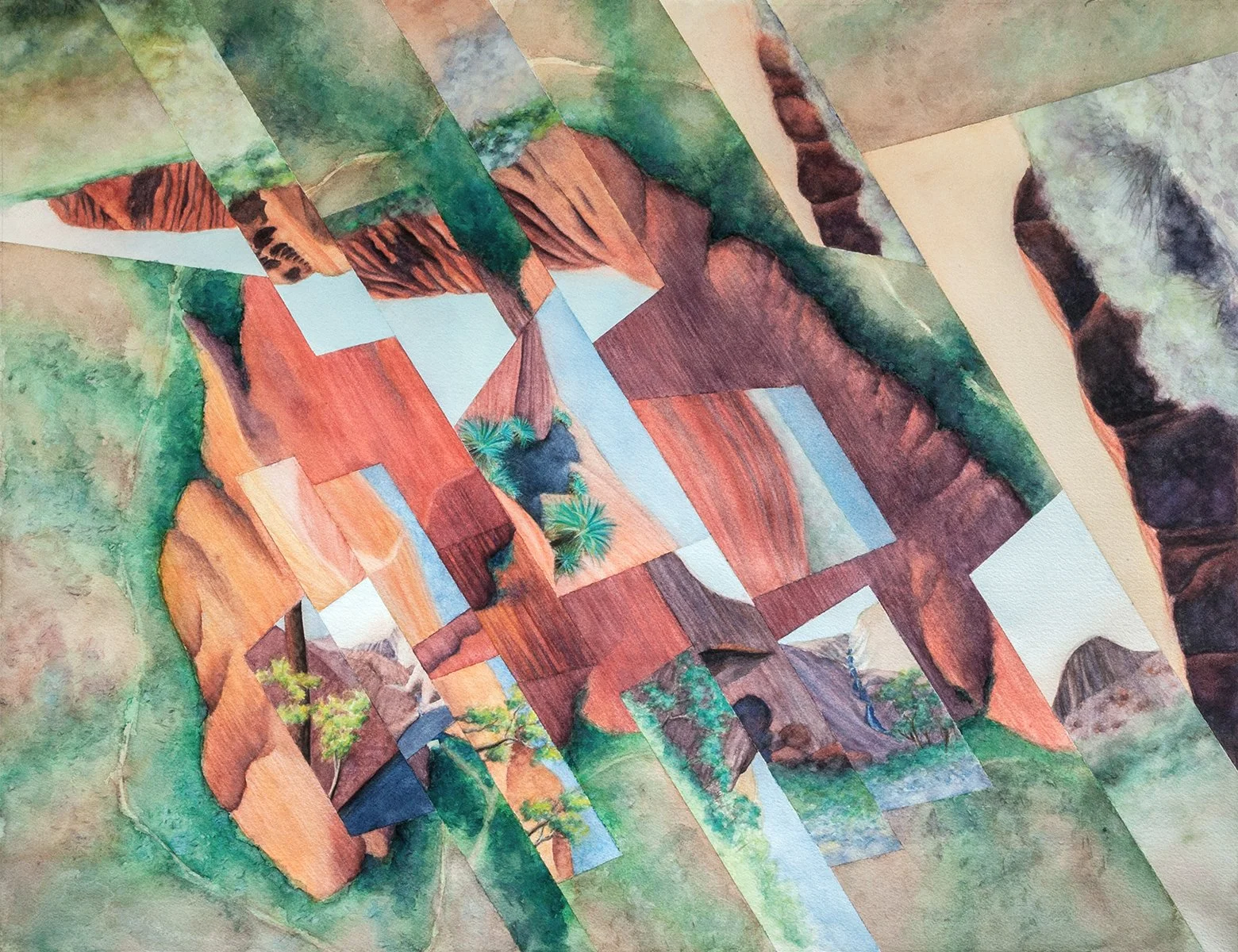
Abstract watercolor painting inspired by Uluru and Kings Canyon in the Northern Territory, Australia

Rock, watercolor on paper, 20”x26,” with fragments depicting views from the 10km base walk and the imagined summit. This is one work where the compositional pattern is inspired by a physical characteristic of the place, in this case the striated patterns in the sandstone.

Abstract watercolor painting with highlighted hiking routes, inspired by Uluru and Kings Canyon in the Northern Territory, Australia

The highlighted base walk and (lighter) summit trail, somewhat abstracted from the actual routes. The line is broken at the perspective views where I was “standing” off the edge of the paper.

But seeing only the perimeter created a unique challenge for the worldview that would grow out of that day trip. I couldn’t fully “know” the place—i.e. also experience the top of the rock, and the views from it—to the extent that was theoretically possible. Since the goal of the fractured compositions (when they depict a single locale) is to provide that “knowability,” I had to either uncharacteristically leave the summit as figurative black box, inserting the aerial satellite view without anything more immersive, or splice in a different location altogether. Since I was used to cobbling together disparate places in other works, I took the latter approach, using features taken from nearby Kings Canyon. It’s another red-hued landscape, for me most notable for its native cycads. I imagined that the summit of Uluru featured a pool ringed by these cycads, making the entire site essentially an island-within-an-island—an oasis within a giant rock within a plain—in line with my usual islands-and-edges theme. (The oasis was actually a mixing-and-matching job itself, since I had to “transplant” the cycads from their habitat in the canyon to the rock pool which is some distance away.)

Cycads and red sandstone cliffs in Kings Canyon National Park in the Northern Territory, Australia

Cycads at Kings Canyon.

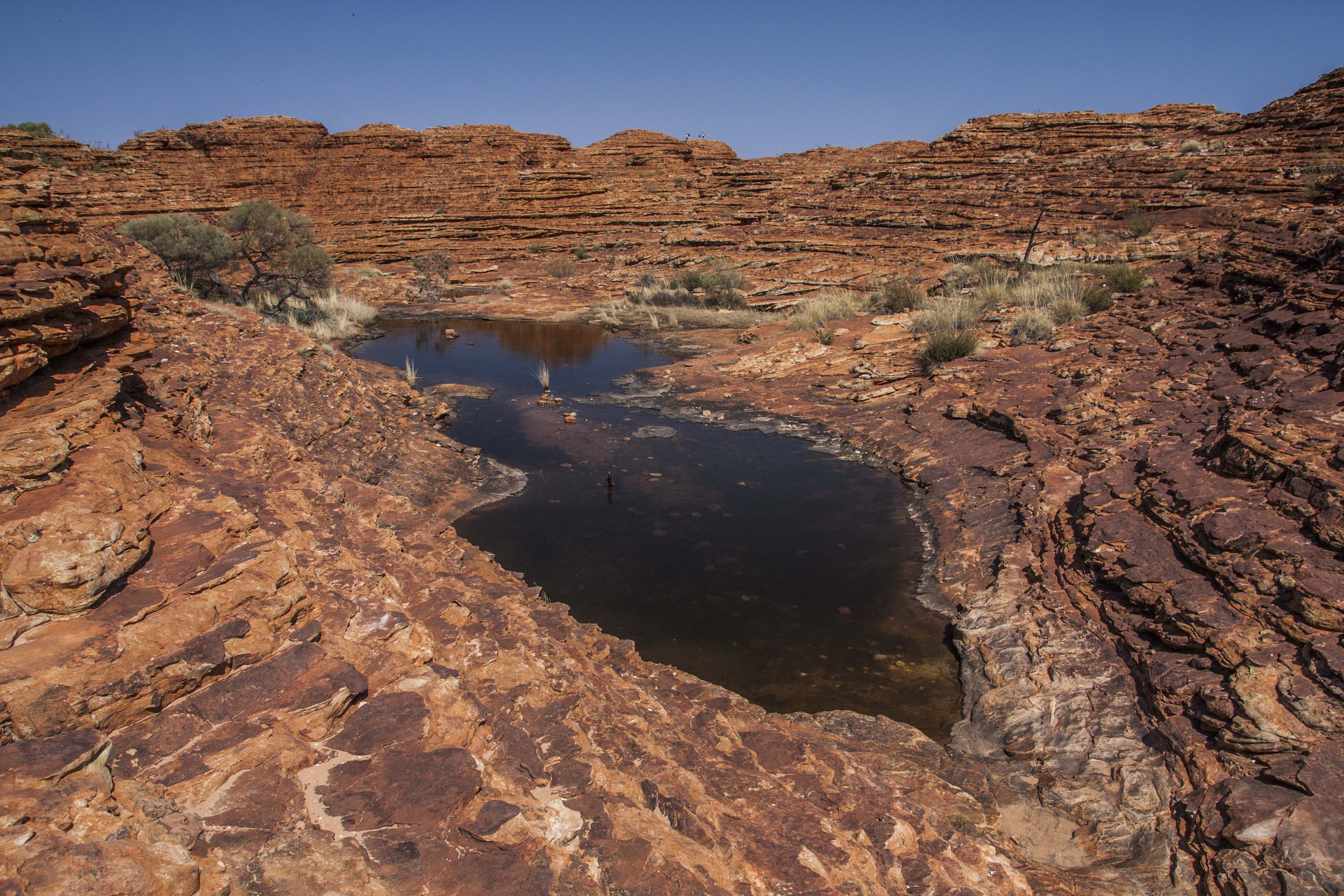
Pool and red sandstone in Kings Canyon National Park in the Northern Territory, Australia

Pool in another part of Kings Canyon, inspiration for the imagined oasis atop Uluru.

So aside from the usual edge/island aspect, the cycad oasis is meant to represent a sort of special yet forbidden landscape, more dreamlike than physical. Writing this now, I’m realizing the connection of that vision to the actual sacredness of the site, and thinking that filling my experience gap with the oasis was kind of a cop-out. It might’ve been an interesting challenge to be more subtle, taking that idea of dreaminess and applying it to what probably actually exists on top of the rock (albeit in a fuzzy, abstract way) rather than something that definitely does not. Maybe another, future version? In that case I’d make more of an attempt to understand the actual sacred meaning of that site, though I expect that’s something I’ll probably want to leave alone….

Ok, that’s all for Australia, at least for the time being—next destination TBD!

Darren

The sandstone monolith of Uluru at sunset in the Northern Territory, Australia

Sanctuary, Revisited

The worldview I’ll talk about below, finished a few months ago, represents a bit of a personal milestone. It’s based on the same place that inspired the “archetype” of the fractured watercolor works that I now make exclusively; essentially it’s a re-thinking of that earlier work, and I can’t help but compare the two in terms of complexity, scale, approach, and, well, skill level (or maybe it’s confidence level?).

Abstract watercolor painting depicting mountains and coastline of Strzelecki National Park on Flinders Island off the coast of Tasmania, Australia.

Sanctuary II, watercolor on paper, 36”x44.” Reality is rotated roughly 180 degrees (with north to the bottom).

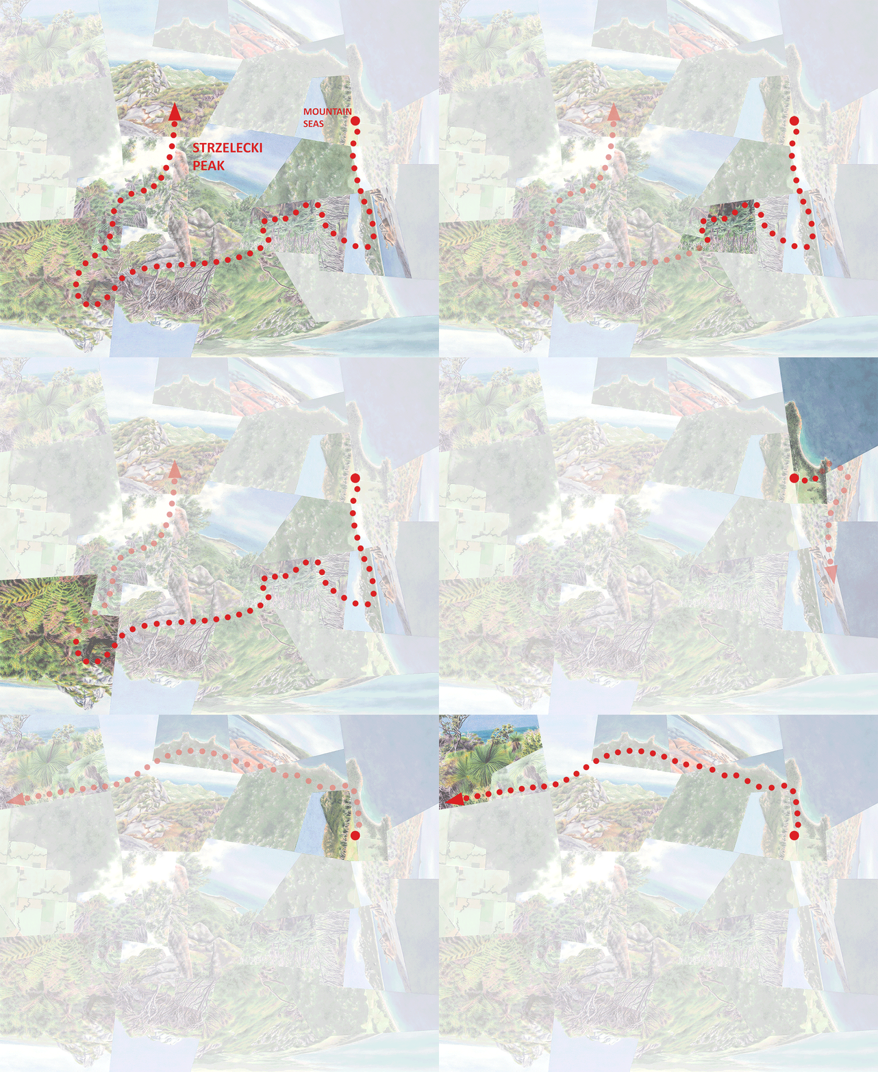
The National Park is made up of two disconnected sectorsone containing Strzelecki Peak, the park’s highest elevation, and the other (much smaller) one on a peninsula containing Trousers Point. The park is squeezed into the southwest corner of Flinders Island between ocean and farmland, covering only about 1/20th of the island’s total area. Mountain Seas sits between the two sectors; the larger one is literally in its backyard. The dashed lines trace my three hikes through the park and adjacent natural areas. (Image from Google Earth; north is up.)

The place is Strzelecki National Park (and surroundings) on Flinders Island off the northeast corner of Tasmania, where I did a month-long artist residency at Mountain Seas Art and Wilderness Retreat in the fall of 2017. Two of my earliest blog posts went into both the place and the original work, Sanctuary (read here about the residency experience and Flinders Island in general, and here about the National Park and how Sanctuary came about), so in this post I’ll be relatively brief with the background. But I do want to emphasize again the amazing ecological diversity of the park’s landscape—as usual one of the main draws for me—and also the incredible-ness of the overall experience. (Even with a lot of rain and the water being too cold for swimming in September, idyllic is the only way to describe it.) So I can’t resist sharing a bunch of photos again, even though you might’ve seen a few of them before.

View of Strzelecki Peak hidden in clouds across a bay at low tide on Flinders Island off the coast of Tasmania, Australia.

View of Strzelecki Peak (in the clouds) across the bay from the peninsula at low tide.

Lush rainforest gully with tree ferns in eucalyptus forest in Strzelecki National Park on Flinders Island, Tasmania, Australia.

Dry eucalyptus forest with tree fern “gully” along a stream in the low elevations of the park.

Forest and rocky granite cliffs of Strzelecki Peak on Flinders Island, Tasmania, Australia.

Low, scrubby forest covers the rockier areas of the park. Strzelecki Peak is in the distance.

Lush rainforest with tree ferns near Strzelecki Peak on Flinders Island, Tasmania, Australia.

More tree ferns in a pocket of rainforest approaching the peak.

View of seacoast and Trousers Point from rocky Strzelecki Peak on Flinders Island, Tasmania, Australia.

View from the peak, looking southwest. Below is Mountain Seas, in the cleared area in the center, and Trousers Point beyond it.

Red rocks, turquoise ocean and beach along the coast of Strzelecki National Park, Flinders Island, Tasmania.

One of the many beaches along the south coast. The red color on the rocks, common across the island, comes from bacteria.

Xanthorrhea australis, or grass trees, near Strzelecki National Park along the coast of Flinders Island, Tasmania, Australia.

Xanthorrhea australis, or grass trees, along the south coastthey tend to prefer rocky or sandy areas. This is a different species of grass tree than the one in the Southwest that I introduced in my last two posts.

Abstract watercolor collage inspired by the vegetation and rocky peaks of Strzelecki National Park on Flinders Island, Tasmania, Australia.

Sanctuary, watercolor on cut and layered paper, mounted on wood, 15”x15.” North is roughly to the left. As I mentioned this work kicked off my current series, when I left the oil paintings (also “fractured” but with purely landscape perspectives) and watercolor-and-plexiglass works (purely bird’s-eye perspectives) behind.

In Sanctuary, which I painted during the residency and assembled back at home (it was my one and only experiment with literally collaging the fragments together, i.e. cutting and pasting), the place is heavily idealized. To accentuate the sense of “smallness,” boundedness, and fragility, I converted the park from an ecological island to an actual island. Plus, I completely invented the landscape in the lower right (representing Trousers Point), wishing there had been grass trees in that particular spot.

In the four years since, the worldviews have become a lot more reality-based—they’re still obviously abstract, but I’ve generally tried to keep the spatial relationships between the fragments relatively true-to-life. That goes along with my recent emphasis on depicting “journeys” from one view to the next that reflect my actual experiences traveling through these places. My reasons for the shift are two-fold. First, fitting my personal, idealized experience of a place into real-world geography is a more interesting challenge than being free to invent that geography from scratch—similar to the advantage of designing with site constraints versus a blank slate in a landscape architecture project. And second, as my purpose has become more conservation-driven, I’ve wanted to highlight the threat to real places rather than take a more escapist approach creating the impression that we’ve already lost them.

So I created the new work, Sanctuary II, to try my hand at keeping the real geography of the place relatively intact while at the same time 1) emphasizing the pieces that were most prominent in my own experience and 2) accentuating the internal contrasts between the park’s varied environments as well as the external contrasts between between the park as a whole and the adjacent heavily altered landscapes (i.e. its nature as an ecological island). That was definitely a challenge because, as shown in the diagram below, there’s a great deal that I wanted to include—along three different “journeys.” There are a lot of landscapes that I couldn’t fit in without making the composition too busy, and as I hope you can tell, it was hard to choose! But another reason for wanting to take a second look at the place was that I’ve gotten a lot more comfortable with working large. Almost everything I’ve produced during the past two years or so is 36” or more on one side (easy with oils, much more daunting and logistically complicated with watercolor). That means I can incorporate many more fragments while maintaining or even increasing the level of detail in each.

Abstract watercolor painting of Strzelecki National Park on Flinders Island, Tasmania, with hiking routes shown.

The work’s three “journeys,” all beginning at Mountain Seas, are generally abstractions of the three routes shown as dashed white lines in the aerial image above (again, with reality rotated 180 degrees). All three are primarily hiking trails but also incorporate some length of road. The first (bottom) mostly follows the two-hour hike to Strzelecki Peak; the second (right) takes in the Trousers Point sector; and the third (top) follows the south coast.

Detail of abstract watercolor painting of Strzelecki National Park on Flinders Island, Tasmania, with rainforest and rocky peak.

Sanctuary II, detail (area around Strzelecki Peak).

Detail of abstract watercolor painting of Strzelecki National Park on Flinders Island, Tasmania, with Xanthorrhea australis or grass trees.

Sanctuary II, detail (grass trees along the south coast).

Animated hiking routes in abstract watercolor painting of Strzelecki National Park on Flinders Island, Tasmania.

The three journeys, animated.

Like all of the worldviews with a conservation message, Sanctuary II combines that message with the seemingly contradictory purpose of heightening the empowering, “world-at-my-fingertips” feeling I get from these sharp contrasts within and around natural environments. As I’ve explained before, that contradiction is resolved if I consider these dual motivations to be two aspects of a protective impulse. I’ve recently been thinking about that control-as-protection as a kind of “embrace.” In my caption for this work as it’ll appear in the Proceedings of the International Cartographic Association I describe it this way:

Taking in the specialness of the place—so close to and yet so far from civilization—and of its many facets gave me the feeling of physically embracing the landscape. That sensation came equally from the knowledge that this small, intricate collection of ecosystems will not easily survive the effects of fire, invasive species, and a warming and drying climate.

So this and most of my other recent worldviews have been more involved and, as interpretations rather than re-imaginations of physical places and experiences, more focused on analysis, precision, and problem-solving than earlier works have been. This new emphasis has been a way for me to re-engage myself in some of what I miss from design practice and, frankly, school. I’m hoping future projects will take me even further (back) in that direction.

Darren

Hotspot | Mt. Martin (& Muppets)

Botanic Park, like Bluff (subject of my last post), is inspired by the botanical richness and uniqueness of the southwest Australian “biodiversity hotspot.” Specifically this work is based on Mt. Martin Botanic Park within Gull Rock National Park, just east of Albany. While both works are fragmented in my standard way, vegetation in the traditional scenic sense plays a more prominent role than usual relative to my typical cartographic focus on edges, contrasts, and sequences. Below you’ll see more of why that is.

Abstract watercolor painting of Mt. Martin Botanic Park in Gull Rock National Park near Albany, Western Australia, with Kingia australis.

Botanic Park, watercolor on aquabord, 18”x24.” I haven’t animated my “journey” through this one because it’s a sense of “smallness” that I’ve tried to emphasize rather than distance or extent. (Plus the hike itself wasn’t very linear.)

Having said that though, Botanic Park does emphasize geographical edges more than Bluff—specifically the coastline and the city-nature contrast. (The latter is an accentuation, since the suburb of Albany across the water is actually smaller and less dense than what you see. To heighten the contrast I’ve relocated the downtown, a bit farther away, to that spot.) Those geographical edges, along with the site’s small area and gentle topography compared to the monumentality of Bluff Knoll, gives it a particular aura of delicacy and fragility—a sense of being “on the edge”—on top of the biological preciousness and precariousness of the region as a whole. My overall fragmentation/compression of the park’s area, and the work’s relatively small dimensions compared to most of my other recent ones, are meant to underscore that feeling.

Kingia australis on Mt. Martin, reaching up to 8m in height.

Kingia australis on Mt. Martin, reaching up to 8m in height.

Muppet-like Kingia australis plants in Mt. Martin Botanic Park in Gull Rock National Park near Albany, Western Australia.

That sense of smallness and delicacy has do with more than just geographical scale. I mentioned last time how smitten I was with some of the plant species in this area; at the top of the list would be Kingia australis, found only in this region and the only species in its genus. I found these plants to be comically endearing (do I even need to mention The Muppets?); they seemed to be having fun, as if enjoying the attention I was giving them for being so special but also blissfully and innocently ignorant of the vulnerability that comes with that status. (Yes, I do often anthropomorphize plants. It’s usually when they have a tuft of leaves at the top of a single stem—probably part of the reason I’m so attracted to palm trees. Oaks, in contrast, I don’t think have much of a personality.)

Muppet-like Kingia australis plants in Mt. Martin Botanic Park in Gull Rock National Park near Albany, Western Australia.

I briefly used this as my Facebook profile pic.

Muppet-like Kingia australis plants in Mt. Martin Botanic Park in Gull Rock National Park near Albany, Western Australia.

This one makes me think of a little kid who’s bad at hide-and-seek.

Muppet-like Kingia australis plants in Mt. Martin Botanic Park in Gull Rock National Park near Albany, Western Australia.

The usual suspects.

Red flower of scarlet banksia in Mt. Martin Botanic Park in Gull Rock National Park near Albany, Western Australia.

Mt. Martin does have other noteworthy plants, including the region’s most significant remaining stands of the scarlet banksia.

Xanthorrhea or grass tree in Mt. Martin Botanic Park in Gull Rock National Park near Albany, Western Australia.

A grass tree (Xanthorrhea sp.)as I wrote last time, it’s actually not closely related to Kingia. This was my favorite Australian plant until I discovered the latter. Kingia tends to have a much “daintier” look.

Looking down the coastline of the National Park, with a few Kingia poking out of the canopy on the right.

So I’ll end this post on a more lighthearted note than I did the previous one (i.e. with no mention of bushfires).

Next time, to the other side of the country….

Darren

Hotspot | Bluff Knoll

In this post and the next I’ll share two worldviews that, as usual, involve environmental edges and journeys. But those spatial, cartographic aspects (my typical focus) are of comparable importance to what I consider the more “painterly” goal of capturing scenery itself, independent of contrasts between scenes—something that I usually approach like an afterthought. The shift in emphasis came from the special connection I felt to the vegetation of the region that inspired both works—a connection that was aesthetic but also influenced by knowledge of the area’s biological significance.

Southwestern Australia—the region around Perth—has a generally Mediterranean climate; its temperature and precipitation levels, and range of landscapes from scrubland to dry forest depending on more localized conditions, resemble southern California, South Africa’s Cape Province, central Chile, and the Mediterranean Basin. Like all of those regions this one has been identified as a “biodiversity hotspot” given its high levels of diversity and endemism combined with its vulnerability to human threats. (The moderate climates of these zones have historically made them particularly attractive to settlement and exploitation.)

Coastal vegetation along the turquoise sea in Fitzgerald River National Park, Western Australia.

Fitzgerald River National Park. It’s also worth noting that the beaches in this region rival those in the tropics; the fact that they’re unfortunately barely swimmable in October (when I was there) was a bit incongruous.

Natural bushland in Kings Park, an urban park in the city of Perth, Western Australia

An area of natural bushland in Kings Park, Perth.

Coastal vegetation, blue ocean and rocky coastline in Cape Le Grand National Park, Western Australia

Cape Le Grand National Park.

Colorful Banksia, Kingia and other vegetation in the bushland of Stirling Range National Park near Albany, Western Australia

Stirling Range National Park.

Grove of Xanthorrhea or grass trees in the bushland of John Forrest National Park near Perth, Western Australia

Grass trees (Xanthorrhea sp.), John Forrest National Park.

The variety of colors and textures in the vegetation gives you a sense of the area’s species richness. There’s also a number of particularly eye-catching native plant species including banksias, cycads, and two genera that on the surface look like they must be closely related but in fact aren’t, Xanthorrhea (grass trees) and Kingia. Those last two (like most palm look-alikes) are particular favorites of mine, and so I featured them prominently in the following work and even more so in the one I’ll talk about next time.

Yellow banksia flowers in the bushland of Mt. Martin Botanic Park in Gull Rock National Park near Albany, Western Australia

Banksias, Mt. Martin Botanic Park.

Cycads in the bushland of John Forrest National Park near Perth, Western Australia

Cycads, John Forrest National Park.

Large branching Xanthorrhea or grass tree in John Forest National Park near Perth, Western Australia

A branching Xanthorrhea, John Forrest National Park.

Flowering Xanthorrhea or grass tree in John Forest National Park near Perth, Western Australia

And another one in flower nearby.

Darren Sears plant selfie with Kingia australis in Sterling Range National Park near Albany, Western Australia

Kingia australis, the only member of its genus and only found in this part of Australia. Unlike Xanthorrhea it never branches. (This shot is part of my acclaimed plant-selfie genre :-D )

Flowering Kingia australis in Mt. Martin Botanic Park in Gull Rock National Park near Albany, Western Australia

Kingia is also distinguishable from Xanthorrhea by its radially-arranged flower clusters..

The evocative plant life, combined with the awareness that there isn’t much of it left intact, made the landscape feel special and precious. Though my standard fracturing method in these two worldviews wasn’t so much about squeezing landscape contrasts into a more digestible scale, I did intend for it to create a sense of delicacy and vulnerability—part of the “protective impulse” that also motivates me to depict these places.

Stirling Range National Park, located about an hour inland from the coastal town of Albany, protects a particularly rich assemblage of plant species—more than the entire British Isles within its 448 sq. mi. The park incorporates the Range itself, rising to about 3600 ft., and otherwise gently rolling topography. Bluff Knoll, the highest peak, is climbable within a few hours, and that hike (images below) is the subject of the worldview that I’ll share here. Despite the elevation change there wasn’t a noticeable ecological gradient from base to summit that would suggest higher rainfall or cooler temperatures; instead the vegetation became lower and sparser toward the peak as the landscape became steeper and rockier. It was absolutely a rewarding hike in terms of the changing views and topography, but again what stood out to me most was the overall richness of the plant life.

Kingia australis at the base of Bluff Knoll in Stirling Range National Park near Albany, Western Australia
Red Banksia plants, Kingia australis and other colorful vegetation at the base of Bluff Knoll in Stirling Range National Park near Albany, Western Australia
Colorful bushland on the slopes of Bluff Knoll in Stirling Range National Park near Albany, Western Australia
Slopes with scrubby vegetation and rocky summit of Bluff Knoll in Stirling Range National Park near Albany, Western Australia
Xanthorrhea or grass trees in scrubby vegetation at the summit of Bluff Knoll in Stirling Range National Park near Albany, Western Australia
Yellow flowers and other colorful plants and view from summit of Bluff Knoll in Stirling Range National Park near Albany, Western Australia

View from the summit.

 
Abstract watercolor painting of the rocky landscape and colorful plants of Bluff Knoll in Stirling Range National Park near Albany, Western Australia.

Bluff, watercolor on paper, 48”x36.” Bluff Knoll itself fills the top half of the composition. In most of my works the shapes of the fragments develop organically in the process of fitting the scenes together, but when possible I try to design the overall pattern to respond to some general quality of the place. In this case it was the fracturing patterns of the geology.

 
Detail of abstract watercolor painting of the rocky landscape and colorful plants of Bluff Knoll in Stirling Range National Park near Albany, Western Australia.

Bluff, detail.

 
The journey to the top of Bluff Knoll, animated.

The journey to the top of Bluff Knoll, animated.


Sadly in 2019, two years after my visit, a wildfire destroyed much of the park, impacting about one-third of it. Bluff Knoll itself seems to have escaped the worst, but the most devastated areas aren’t expected to ever fully recover. (And this will keep happening of course, there and in so many other places. As we all know, fires are another major threat to this particular biome.) And even the striking flora I saw when I was there wasn’t at its best—the invasive fungus Phytophthora has been causing dieback in about half of the region’s native species. Before-and-after photos make the decrease in cover and diversity obvious, but it says a lot for the riches of this hotspot that otherwise I wouldn’t have guessed it.

In the next post, another nearby gem—not yet turned to charcoal as far as I know….

Darren

Mapping "The Last Island" | Emergent Elements

With an end-of-September deadline to pre-record my “Musical Space, Geographical Time” talk for October’s NACIS meeting (they’re requiring pre-recording for anyone considering presenting remotely), my musical mapping experiments with The Last Island are winding down. So this should be either the last or second-to-last post dealing with the topic (maybe to your relief)—soon I’ll be back to focusing on geographical journeys in paint and real-life.

The three following musical elements—key brightness, relative key (i.e. key variability), and relative “height” (i.e. “height” variability)—all have to do with the concept of "key.” (Relative “height” incorporates other characteristics too, as I’ll say more about below, but key is an important component.) I’ve been going back-and-forth on whether these three aspects of key are actually distinct or “real,” not just for listeners in general vs. myself but even to my own ears. And I’m not sure that’s even resolvable. So the point of mapping and describing them separately is largely to raise that very question. As usual I’m always anxious to hear your thoughts!

I think of these three elements as related in that they, like “key” in general, are “holistic” or “emergent” characteristics of music. They tend to be properties of the entire score rather than individual voices, and tend to be established over extended lengths of time rather than a few beats or bars. There are exceptions to both of these tendencies: in theory a set of voices can play in one key while another set plays in another, following multiple “paths” (this is something I do play with in The Last Island, see below); and it’s possible for key or “height” to be defined over just a beat or two depending on context. But these elements generally aren’t systematically quantifiable voice-by-voice or bar-by-bar as other elements are.

Musical mapping of The Last Island, a composition for symphony orchestra representing the ascent of an imaginary tropical island.

Maps of key brightness, relative key, and relative “height,” aligned with the geographical elements they’re meant to evoke. (For complicated reasons I’m now calling them “geographical” instead of “environmental.”)

Key Brightness

Do certain keys sound “brighter” that others? Doing some research would probably clear the question up further, but based on personal experience and informal conversations it seems to be the case. It’s probably more perceptible to certain ears than others (my having near-perfect pitch—though somehow over the past few years consistently a half-step off—is a likely factor), and which keys sound brighter or darker to those ears probably doesn’t follow a consistent pattern. I think it’s fair to say that to pretty much everyone all the time, major keys sound brighter than minor keys. But that’s a function of intervals rather than some hard-to-define characteristic of absolute pitch. While I tend to hear keys with lots of sharps/flats as darker, that could be a subconscious association with black keys on the piano, and it doesn’t always hold true.

So my process of selecting bright vs. dark keys in writing The Last Island, or evaluating it later in places where there was less intent involved, was based mostly on gut impressions. Later I tried to fit them into a quasi-scientific system; looking back at my cryptic notes (below) I’m having trouble figuring out exactly how I went about it. But a system did come together, relating to number of accidentals as I mentioned above.

The takeaway from the key brightness map (the central black-and-white band on the sheet of parallel maps above), in terms of how it corresponds with the geographical elements it’s meant to evoke, isn’t as straightforward as with other musical elements that I’ve shared before (like attack and instrumentation). Those other elements show an overall intensification building up to and then down from the musical/geographical “climax” point. But I think what does come across in this one is darker keys corresponding to 1) darker forested landscapes in the middle third of the piece and 2) the ominous mood at the very end as deforested landscapes “appear,” in both the slides and the music, in the distance. (That location in the distance explains the hatched dark-and-light zones at the tail end. Certain voices play in a dark key depicting that distant but encroaching destruction, while the rest play in a brighter key to represent the for-now-preserved foreground.)

Relative Key

I’ve been thinking about key brightness as an “absolute” quality—you can sense how bright or dark a key is even if you hear it in isolation. But with relative key (above/to the right of brightness on the sheet), the relativity is the point—what matters is key changes, or key variability, not characteristics of the individual keys. (For the mathematically-minded among you, taking this a step further would mean drawing a map of the derivative of the key, rather than the keys themselves as I've done above.)

So in this case I’ve represented the different keys as colors along the rainbow spectrum rather than on a greyscale. Similar keys, like C major and G major or C major and A minor, are denoted by similar colors so that the more dramatic the key change, the sharper the color contrast. A greyscale would’ve shown those contrasts too, but each shade of grey by itself would’ve suggested an “absolute,” intrinsic level of something, whether that’s brightness or some other quality. Color indication, however, seems appropriately arbitrary (though, having synesthesia, now that I think about it these colors could in fact represent some absolute quality of each key—maybe a future map?). Plus, key changes are fundamentally changes in musical “color” that outweigh the probably less perceptible changes in brightness. Having said all this though, I’m not totally sure that what I’m perceiving as a “color” change isn’t actually a “brightness” change. Again, I’m not even sure that’s answerable, for my own ears let alone everyone else’s. Think of these as possible ways of experiencing key, whether or not they’re actually distinct.

I wrote key changes into The Last Island to evoke a combination of things: 1) shifts in scenery or atmosphere (overlaid with considerations of brightness as described above), 2) physical exertion/movement of the traveler/listener, and 3) the complexity or “energy” of a particular scene. The zone of rapid key changes around the climax point represents a mix of all three of these. Overall, more and sharper changes in key/color mean a heightening of sensation, which like in the earlier maps tends to correlate with a cumulative intensification of the physical environment. (I don’t claim any originality in using this technique—you’re probably familiar with what’s been disparagingly called the “truck driver’s gear-shift” in pop music, where half- or whole-step key changes are inserted to heighten emotion. I did try to be more subtle than that in most cases.)

Back to the question of representation—using the rainbow gradient, as opposed to another type of color gradient, has some issues. Not all segments of it (say, yellow vs. blue) are of equal “strength” to the eye, and so contrasts between those sections aren’t either. It follows that in the map, the apparent degree of contrast between different keys likely doesn’t quite correspond with reality (if there is a reality to all of this to begin with). So I’ve made a version using a smaller segment of the rainbow spectrum—red to yellow—which doesn’t eliminate the strength disparities but might at least limit the range of contrasts that could be misleading. The two versions are lined up below.

A musical map of key changes in The Last Island, a composition for symphony orchestra representing the ascent of an imaginary tropical island

Relative key, full rainbow gradient. Sharper color contrasts represent sharper contrasts between keys.

A musical map of key changes in The Last Island, a composition for symphony orchestra representing the ascent of an imaginary tropical island

Relative key, red-yellow gradient. Are the contrasts easier to compare even though their range is limited?

Relative “Height”

I mentioned that I used key changes to represent physical movement/exertion—that usually means climbing uphill (I’m thinking this imaginary island rises to at least 10,000 ft.). But the sensation of elevation change in the piece isn’t just a matter of key change; it’s combined with rising or falling melodic lines as well as harmonic changes that don’t necessarily represent key changes. (The combination of those elements also indicates “height” in a broader sense than geographical elevation, incorporating emotional as well as elevational “heightening.”) Because of that mix, composing and then mapping changes in “height” is largely intuitive and I’m not even positive that it’s a real thing at all (the reason I’ve put it in quotes). And again, there is a question of whether the” key” component can really be separated from the two other key-related elements. But for experimenting/mapping purposes I’m doing it for now.

The obvious way to map “height” is with a rising/falling line, and that’s what I did at first (turned into the “section-cut” drawing below). But that’s different from all the other maps, which use a color gradient or a greyscale to measure different intensities or levels, including even the geographical elevation map. Though geographical elevation change is a form of spatial variation, the whole concept of musical mapping deals with 2-D/horizontal space. The “vertical” dimension of music that I described with the 3D model in my first music-related post is a function of the stacking, layering, and simultaneity that music allows; it doesn’t represent vertical position in physical space. So except where I’ve wanted to break elements into the different musical voices or instruments (as in previous posts), these maps of musical elements are meant to represent views from “overhead” rather than “from the side.”

A musical map of relative height in The Last Island, a composition for symphony orchestra representing the ascent of an imaginary tropical island

Relative “height,” represented in its most literal sense by a rising/falling line.

So on the sheet, I’ve instead represented relative “height” with a color gradient. Like relative key it’s meant to focus on height change rather than an absolute or intrinsic quality; in this way it’s different from the geographical elevation map, where I’ve used a greyscale.

But as I explained above with relative key, the rainbow gradient can be confusing since all zones of the gradient and the contrasts between them aren’t perceptually equivalent. Using a smaller zone of the gradient wasn’t really an option this time since there are many more “height” changes than key changes and I needed the full range to capture that subtlety; so I ended up just going with the grayscale. Here I’ve compared it with the original rainbow version:

A musical map, with rainbow gradient, of relative height in The Last Island, a composition for symphony orchestra representing the ascent of an imaginary tropical island

Relative height, rainbow gradient.

A musical map, with greyscale, of relative height in The Last Island, a composition for symphony orchestra representing the ascent of an imaginary tropical island

Relative “height,” greyscale.

I think the rainbow version definitely emphasizes the changes (overall variability), especially the more subtle ones. In the greyscale version the “climb” right before the climax point, two thirds of the way through, overshadows everything else. The gradual darkening (“intensifying”) shifts the focus from variability to the absolute “height” of the different zones, which doesn’t have much meaning in the musical sense. If you took the lightest and darkest portions of the greyscale map and listened to those segments of the piece one after the other, you wouldn’t necessarily perceive a “height” difference: it’s mostly the musical transitions that evoke those differences, and of course there would be no transition in that case. But maybe the color version just isn’t intuitive enough as a representation of “height,” lacking any indication of absolute “highness” and “lowness,” even if it’s meant to representing something less concrete.

Ok, there’ll be maybe one more of these music-related posts to come, but soon I’ll be taking you to Australia for a while….

Darren

Highlands

This example of a dry-to-wet gradient is, in its own way, as dramatic as the one I shared in my recent post on the Lomas de Lachay in Peru. The dry end here isn’t a barren desert as it is there, but the wet end is much wetter—in fact, too wet for native trees to grow.

Ocean view of San Cristobal Island in the Galapagos from a boat ride.

San Cristóbal Island from the boat.

San Cristóbal Island in the Galápagos is one of the archipelago’s four inhabited islands and one of those that are large and high enough to support moist highland zones above the arid lowlands. The precipitation comes largely from fog rather than rainfall, essentially the same fog that feeds the lomas formations on the mainland. The cold Humboldt Current, which flows up the coasts of Chile and Peru and then heads westward past the Galápagos, is a chief factor responsible for the fog and low rainfall in that entire region. On the mainland though its effect is amplified by other conditions (related to latitude and topography) that reduce rainfall to nearly zero along the coast; the “desert” lowlands of the Galapagos look lush in comparison, and the highlands do receive enough actual rainfall, in addition to the fog drip, to support forests as opposed to the “wet savannas” of the lomas. But above those forests, as I said earlier, precipitation is high enough that no native trees have evolved to survive, resulting in a shrubby or boggy landscape which at the highest elevations (the “fern-sedge” zone) is somewhat reminiscent of the moors of the United Kingdom.

Columnar cacti and lava rock in the arid zone of San Cristóbal.

Cacti and lava rock in the lowlands of San Cristóbal.

Dry forest and cliffs in the arid semi-desert zone of San Cristobal Island in the Galapagos.

Another view of the lowland arid zone, notably with the vegetation in leaf (this scene would typically be grey/brown for half the year).

Lush miconia shrubland in the wet and foggy highlands near El Junco lagoon, on San Cristobal in the Galapagos Islands.

Miconia shrubland in the treeless highland zone, on the hike up to El Junco lagoon.

El Junco lagoon in volcanic crater in the wet and foggy highlands of San Cristobal in the Galapagos Islands.

The misty shores of El Junco.

But as I wrote in my previous post on nearby Santa Cruz Island, these wet highland environments are critically endangered. On San Cristóbal the native highland forests, composed of trees of the genus Scalesia in the daisy family, have been completely eradicated by agriculture and grazing (though there are reports of a few trees clinging to an inaccessible cliff face somewhere). Of the treeless zones above that few pockets remain, and those have also been degraded by cattle and invasive grasses filtering in from adjacent pastures. One of these pockets (or possibly the only one, at least that’s accessible) exists around El Junco lagoon, a crater lake containing the archipelago’s only source of fresh water. It’s not the island’s highest point but at 700m it’s close to it—though that elevation seems like nothing considering its dramatically different climate from the coastline.

Aerial view of San Cristóbal with the route(s) of travel depicted in the worldview below. Except for the segment north of Puerto Baquerizo Moreno (the main town and the provincial capital) and the loop around El Junco, which are hiking trails, the route consists of the island’s only long-distance road, about 25km long. The oval-shaped area of darker green identifies the wetter highlands, which might stand out more against the lowlands if the image had been taken a different time of the year. This view includes about half of the island, containing the entire highland zone. (Satellite image from Google Maps.)

Aerial view of San Cristóbal with the route(s) of travel depicted in the worldview below. Except for the segment north of Puerto Baquerizo Moreno (the main town and the provincial capital) and the loop around El Junco, which are hiking trails, the route consists of the island’s only long-distance road, about 25km long. The oval-shaped area of darker green identifies the wetter highlands, which might stand out more against the lowlands if the image had been taken a different time of the year. This view includes about half of the island, containing the entire highland zone. (Satellite image from Google Maps.)

Since the native forest in-between has been replaced by agricultural/grazing land, the half-hour drive from well-preserved arid lowlands to comparatively intact, saturated highlands (and then back down to arid) along the main road doesn’t represent an ideal ecological gradient. But, the dry-to-wet transition is still obvious and surreal, and it inspired the worldview below.

Abstract watercolor painting of the arid lowlands and moist highlands of San Cristobal Island in the Galapagos.

Highlands, watercolor on aquabord, 24”x36.” As mentioned above the arid zone looked relatively lush when I was there, so except where I could incorporate cacti it was a challenge to make a clear distinction between the lowlands and highlands while staying relatively true to the experience. I ended up playing up the browns and purples in the arid scenes and using more yellowish greens (mostly to suggest stronger sunlight).

This work depicts something between what I’ve been calling a “wandering” (lacking a clear, linear path of travel) and a “journey” (based on such a path) because that 25km trip actually cobbled together multiple trips and detours—both the yellow path above and the abstracted red path below are simplifications. Plus you’ll see the abstracted version is messy to diagram since portions of it extend beyond the frame. My main reason for diagramming it anyways is to illustrate, compared to the actual route on the aerial photo, how much I’ve distorted the overall shape and length in order to emphasize the parts of the experience that made the strongest impression, namely the highland zone around El Junco. This area felt like the destination or “resting point”—a special, mist-shrouded world unto itself—even though the trip actually continued on to the opposite coastline.

An animated journey through Highlands, along an abstraction of the actual (yellow) route. It begins as a hike through the semi-desert from Muelle Tijeretas (a diving site) to the main town of Puerto Baquerizo Moreno, where it picks up the road, rises into the cultivated highlands and passes through the village of El Progreso (mostly hidden beneath the clouds in the aerial fragment). The road emerges into the treeless highlands, where the trip follows a roughly one-hour hike up to and around El Junco lagoon. Returning to the road, the journey runs downhill back into the arid lowlands, ending at the beach at Puerto Chino.

An animated journey through Highlands, along an abstraction of the actual (yellow) route. It begins as a hike through the semi-desert from Muelle Tijeretas (a diving site) to the main town of Puerto Baquerizo Moreno, where it picks up the road, rises into the cultivated highlands and passes through the village of El Progreso (mostly hidden beneath the clouds in the aerial fragment). The road emerges into the treeless highlands, where the trip follows a roughly one-hour hike up to and around El Junco lagoon. Returning to the road, the journey runs downhill back into the arid lowlands, ending at the beach at Puerto Chino.

Another aspect of the experience that I found inspirational, besides the precipitation gradient, relates to the juxtaposition of natural and manmade landscapes. In this case though, unlike the urban-wild edges that I’ve focused on in other works, it wasn’t a sharp juxtaposition that inspired me but rather a much softer form of proximity that had the same empowering effect. As I’ve said before I find sharp edges between natural and developed landscapes empowering because the former is “wild” but at same time “humanized” by virtue of being both small and isolated. In this case though, while that small-and-isolated condition definitely applies, it’s not easy to perceive since both landscapes are treeless—the island of native landscape has no clear boundary. That sense of humanization is a result not of constriction but of “integration”—the native landscape is merged into the non-native one while still maintaining its identity as “native.” I’m using quotes there because again that nativeness is relative; invading grasses and probably cattle browsing and trampling have turned significant areas of the original shrubland into something a lot more pasture-like, which definitely plays a role in the blurring of the boundary. (So does the persistent mist.) But given the naturally treeless nature of that landscape combined with some degree of denial, I could still tell myself that it represented something special and generally intact.

This is a pretty nuanced perspective (though maybe not much more than my usual take on things) that’s complicated not only to put into words but to convey in paint. I tried though, particularly in the center-bottom fragment which depicts the ferny rim of the lagoon in the foreground grading into pasture below and beyond. That scene didn’t come from one particular photograph, since no single one captures the impression of ambiguity that I’ve described. But the four below, all shot within that fuzzy boundary zone, taken together should give some sense of it.

Shrubland in the wet and foggy highlands near El Junco lagoon, on San Cristobal in the Galapagos Islands.
Lush ferns in the wet and foggy highlands near El Junco lagoon on San Cristobal Island in the Galapagos.
Lush ferny landscape in the wet and foggy highlands near El Junco lagoon on San Cristobal Island in the Galapagos
The wet and foggy highlands near El Junco lagoon on San Cristobal Island in the Galapagos

The fact that I was moved by this ambiguity is an example of the tension I express in most of my works incorporating human-dominated landscapes, between the alternately empowering and destructive aspects of environmental manipulation. But since in this case that manipulation doesn’t involve sharp edges, my guess is that neither of those aspects comes out very strongly in the work—outwardly at least, the composition is more about the precipitation gradient. And from that perspective I certainly wish the only treeless landscapes on the island were the ones that evolved that way.

Darren

Mapping "The Last Island" | Note Length

Ok, back to “musical mapping” temporarily. As I’ve said I’m proposing a talk for this fall’s Annual Meeting of the North American Cartographic Information Society on the relationships between musical and geographical space and ways of “mapping” those relationships, applied specifically to The Last Island. Again these ideas tend toward the academic, and the mapping part is still a work-in-progress, so my main goal in showcasing them here is to pace myself and test them out; I’m mostly curious as to how well the imagery communicates the broad points even without all the explanation. Maybe parts of it are interesting purely as artwork? (Probably not yet.) If the whole thing is too abstract, then just listen to the piece if you haven’t yet—I’ve heard enough reactions that I can promise you’ll find it soothing :-) .

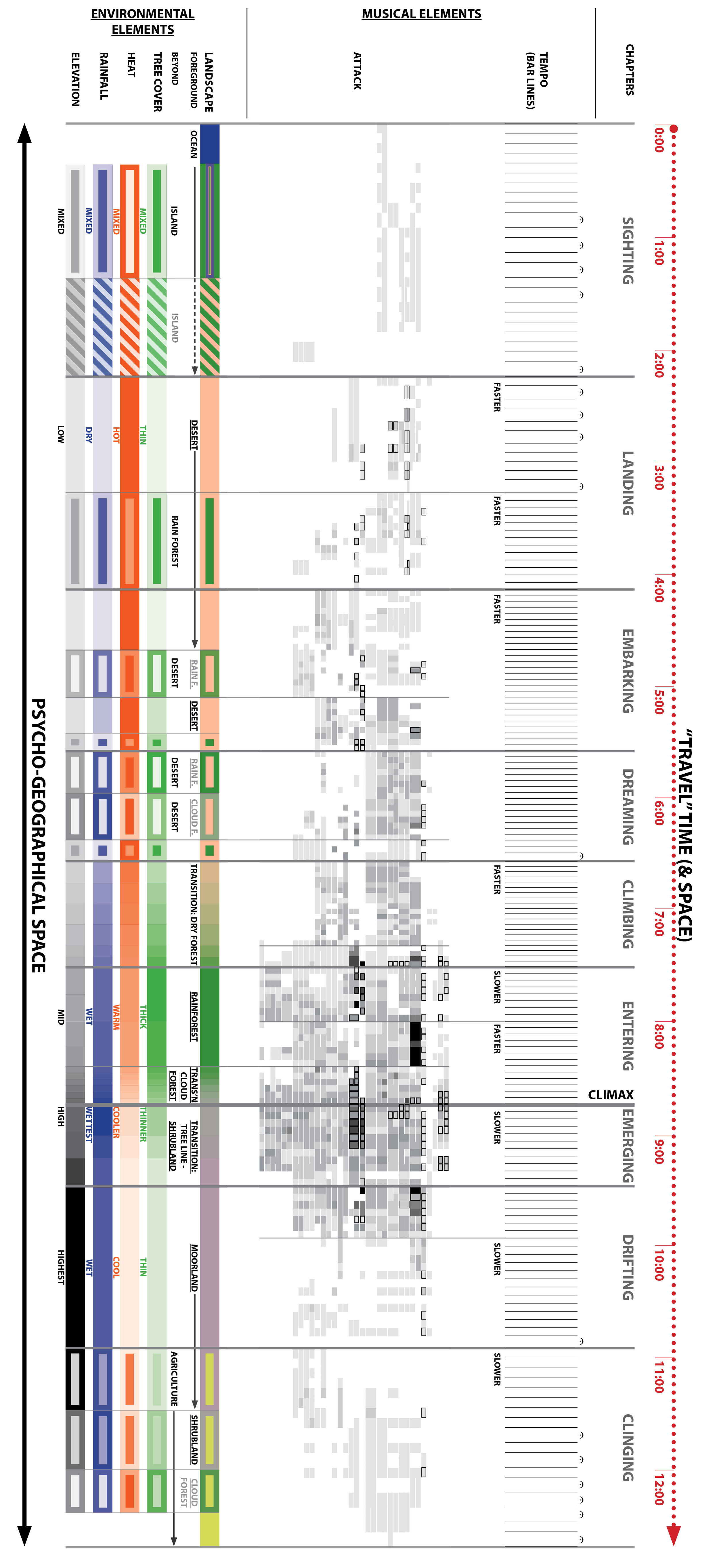
For a quick recap of the mapping approach (much more detail here if you dare), I’m analyzing the piece in terms of three categories of elements: environmental, visual (painted), and musical. The three categories correspond/align with each other to varying degrees, i.e. the music evokes the painted imagery (the slides in the video) which in turn depicts natural environments/landscapes along the island journey. Since I wrote the piece before selecting the visual imagery, setting up the framework for this mapping process, or knowing that I was going to do either one of those things at all, those correspondences vary in their strength and clarity. Even if the composition had come at the end instead of the beginning that might still be the case, given that slavishly tying the choice and progression of musical elements to, say, rainfall or elevation might not have produced the most listenable piece; that would've been a bad outcome despite my OCD compulsion to treat it like a research subject. (I’m realizing that it fits in well though with my cartography-not-painting framing of the worldviews.)The point of the mapping exercise then is two-fold: 1) to figure out the best ways of visually representing those correspondences, so that they can be absorbed more quickly and clearly than in the 12-minute duration of the piece, and 2) to get a visual sense of how strong those correspondences actually turned out to be, given what I just said about not obsessing too much about them during the composition process.

Turning to the maps/diagrams themselves, again think of the bands representing the environmental elements as abstractions, layered on top of one another, of the island landscape seen from above (and seen from within in the painted slides). Think of the musical elements as abstractions of the printed musical score, standing on edge as it winds through the visual/physical landscape. And given the length of the diagrams I’ve oriented the image vertically; I’ll be referring to top, bottom, left and right as if you were looking at the sheet horizontally. (Go to the website to see slightly larger versions.)

Musical Elements: Note Length

A musical map of The Last Island, a composition for symphony orchestra representing the ascent of an imaginary tropical island.

The maps I shared before illustrated the “structural elements” of theme and path—in quotes because they’re not musical “elements” themselves so much as frameworks for organizing what I consider the actual elements of pitch, tempo, dynamics, instrumentation, etc…Here I’ll go into two of these actual musical elements, attack and tempo, grouped together because they’re both aspects of note length. (“Rhythm” is too, but since I’m more concerned with general variations in note length from measure to measure or section to section than from note to note, I don’t plan to deal with it.)

  1. Attack. I still need a better term for this—I mean it as the number of discrete notes, whether of the same pitch or different pitches (“note” implies pitch, so that term won’t work) begun or “attacked” within some given time interval such as a measure. (A note tied over from the previous measure doesn’t count.) I’ve tallied the number of attacks per measure for each voice/instrument (each voice/instrument represented by a horizontal band), and depicted the count on a grayscale gradient from light (1-2 attacks per measure) to dark (27-32 per measure, unscientifically increasing the range at the upper end assuming that adding a note is less perceptible when there are more of them).

    The outlines of varying thicknesses around some of the boxes represent effects (occurring somewhere in that measure) where it’s impossible to count the number of attacks or where the notes are played so quickly that it’s hard to evaluate how important they are—think of these as another layer of activity on top of the tally of “regular” notes. From thinnest to thickest outline, again representing a gradient from least to most activity, these are 1) grace notes, 2) rolled chords or glissandi (mostly on the harp), and 3) trills (including rolls on percussion).

    (Incidentally I’ve arranged voices/instruments differently than in a standard score, ordering percussion, strings, winds, and brass from top to bottom. With this arrangement the map gets “thicker” where the percussion and brass are the most active, rather than just denser (with internal gaps getting filled in). Thickening seems a bit more impactful at a glance than densifying, plus the typical score arrangement is completely arbitrary for what I’m trying to communicate.)

  2. Tempo. Number of attacks per measure only captures ones aspect of note length, because measures don’t all take up the same amount of time even if the time signature (number of beats) is constant. So, the relative tempo speeds need to be illustrated as a separate map or layer. There’s an easy way to do that: since I’ve set up the diagrams for time to progress at a constant rate from left to right (see the ticker tape at the top of the sheet), bar lines (measure divisions) will be farther apart at slow tempos than at fast tempos, and if they contain fermatas (holds) at any tempo. Analogous to the attack diagram, this results in a darker/denser appearance (i.e. more activity) where the tempo is faster.

As with the theme and path diagrams, the vertical lines are my attempt to call out the alignments and misalignments between the different types of elements; basically they represent the edges between experiential zones. This time I’ve added a higher level of zone, separated by the thicker lines, labeled at the top of the sheet as “chapters.” Think of these as broader divisions of the musical narrative based on activity or mood; in the video the labels appear on the first slide of each chapter.

Ideally the attack and tempo diagrams would be superimposed to create a more complete picture of note length at glance. I’ve tried this (see the sheet below), but the bar line density fades into the background unless I thicken the lines so much as to be distracting. I’ve also tried subdividing the measures with additional lines to further darken/densify the fast tempos, but that just makes everything look darker. Another option, which would take a lot of work but I might do it anyways, is to merge the note tally and beats-per-minute components of each measure into a single number—so for example a measure with 8 attacks but a tempo twice as fast as some chosen baseline tempo would functionally have 16. This would create a more concise and accurate illustration of note length, but also more opaque. (For any of you who can visualize this before I re-calculate a few thousand measures—thoughts?)

Despite all this complexity, I’m hoping what’s clear is a broad-brush correspondence between “high intensity” zones across environmental and musical elements. The zone where elevation, temperature, rainfall, and tree cover are cumulatively greatest/highest—most saturated in terms of color—roughly lines up with the shortest note durations in terms of attack and tempo and what I consider to be the “climax” of narrative at the beginning of the “Emerging” chapter, namely emerging from the cloud forest into the high, bright moorland zone. (This makes me think I might add “sunlight” as an environmental element?)

There is one somewhat obvious misalignment here—the fastest tempos (densest bar lines) actually occur well before the climax point. The chapter label “Climbing” provides a clue though, and later maps will illustrate it better: this could be considered the most “energetic” part of the piece in terms of physical exertion and mental anticipation.

Slow and Fast, Long and Short

Part of me is questioning my decision to represent time linearly from left to right, so that slow tempo zones get stretched out in space and fast zones get compressed. It seemed the most logical way to go at the time. But shouldn’t slower speeds, loosely representing slower walking speeds and less coverage of space, look more compressed and therefore static on the musical map? And consistent with what I said earlier about the map looking “thicker” in zones of greater intensity, shouldn’t a faster traversing of space appear wider on the page, so that overall the map looks “bigger”? I’ve gone ahead and tested out this other option, which I’ve labeled “distorted time” (again, note the ticker tape) and placed side-by-side with the original “constant time” version on the sheet below. In both cases I’ve overlaid the tempo map (the bar lines) with the attack map as I suggested above.

I’ve also added the visual element (the row of slides from the video) back in to show that the time distortion also has the effect of (slightly) un-distorting space: the slides are a little more equal in size relative to the constant-time version. Overlaying the musical score/”journey” on a traditional physical map without any perceptible spatial distortion, as opposed to one of my worldviews where certain landscape fragments can be enlarged to imply more time spent there, would be possible with the distorted-time version because it’s the score that would be instead compressed or stretched out.

A musical map of tempo in The Last Island, a composition for symphony orchestra representing the ascent of an imaginary tropical island.

I haven’t decided yet which version is the better visual representation of relative travel speed and, combined with the light-to-dark attack gradient, overall intensity of experience. Any thoughts on which map shows the middle section of the score as more “active” than the beginning and end?

Going with the distorted-time version might mean that the tempo diagram disappears and gets incorporated into the attack diagram in the way I described above—multiplying the attack tally by some factor representing relative tempo. Otherwise the two diagrams, whether superimposed or not, contradict each other: shorter note lengths mean darker in terms of attacks but lighter (more widely-spaced bar lines) in terms of tempo.

Alright, more musical maps to come later—probably with a little less theory involved!

Darren

Fog Meadows

In my previous post I described a particularly dramatic wet-dry gradient—along a roughly six-hour hike from cloud forest to desert on Robinson Crusoe Island off the coast of Chile. At the beginning of that same 2019 South America trip I visited what might be considered an even more striking example, in the Lomas de Lachay Reserve a few hours north of Lima, Peru.

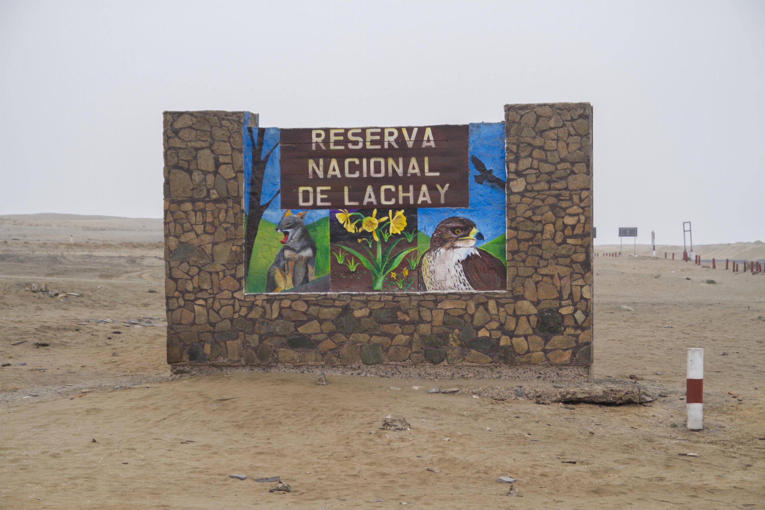
Barren desert and entry signage at the entrance to the Lomas de Lachay Reserve on the Panamerican Highway in Peru.

The Lomas de Lachay Reserve entrance at the Panamerican Highway, about 100m above sea level.

Lush desert oasis and ridgeline in the Lomas de Lachay Reserve in Peru.

The heart of the Reserve and oasis at about 400m.

A Google Maps view of the Reserve during the non-fog season, with the main path highlighted (the straight part is the gravel entry road). The fog is heavily seasonal, generally present from June to October; during the rest of the year the entire lan…

A Google Maps view of the Reserve during the non-fog season, with the main path highlighted (the straight part is the gravel entry road). The fog is heavily seasonal, generally present from June to October; during the rest of the year the entire landscape turns brown, here still visible as darker than the surrounding desert. Actually I had visited this site before, back in 2001, during the dry season and had vowed to return someday during the “right” time of year. I surprised myself a bit by actually following through on that twenty years later. But as you’ll see below, I sort of missed the mark again by getting there in late October at the very tail end of the wet season when the landscape was not at its most vibrant.

Lomas literally means “hills,” but it also refers to a particular environmental condition that I’d consider one of the ecological wonders of the world despite its obscurity: along the nearly rainless coasts of Peru and northern Chile, the foothills of the Andes intersect the coastal fog layer to create lush islands of green surrounded by barren desert. These oases, sometimes called “fog meadows,” are very scattered and restricted, having to do as much with the shape of the topography (trapping the fog more effectively in certain areas) as with elevation.

Lachay is considered one of the best examples of these; the fog creates a gradient from barren desert through grassland, culminating in a sort of wet savanna dotted with lichen-draped trees. While it can’t be called a forest, large shrubs are mostly absent, and those trees are oddly skeletal (I haven’t read anything suggesting that they’ve died, but I saw no evidence of leaves), the contrast between beige and florescent green is still surreal. (For some reason the ecological effects of the fog seem much stronger in Peru than Chile; to the south the lomas are characterized more by profusions of cacti than by continuous carpets of green.)

The walk from the highway to the center of the oasis (where the loop begins) takes about an hour and half, climbing roughly 300m, with an additional hour or so to reach the ridgeline 80m above and then loop back around.

Barren Desert along the Panamerican Highway at the entrance to the Lomas de Lachay Reserve in Peru.

At the Reserve entrance, on the Panamerican highway, the landscape is completely devoid of visible plant life.

Dry lower elevations of the Lomas de Lachay Reserve in Peru.

Entering the reserve, groundcover-like plants (a couple centimeters high) appear after just a few meters of elevation gain. During the height of the fog season, when the moisture spreads consistently over a larger area, this zone would be green.

Grassland and yellow wildflowers in the dry lower elevations of the Lomas de Lachay Reserve in Peru.

The groundcover gradually transitions to taller grasses and herbs…

Grasses and yellow wildflowers in the lower elevations of the Lomas de Lachay Reserve in Peru.

…that become denser and greener.

Grasses and yellow wildflowers in the Lomas de Lachay Reserve in Peru.

Seen looking back downhill, the gradient is particularly striking given the gentleness of the slope.

Lush green desert oasis with vines and skeletal tara trees in the Lomas de Lachay Reserve in Peru

At the center of the oasis the trees appear; a month or so earlier this landscape would’ve been even greener. The ivy-like species, climbing the bases of the trees and covering much of the ground, I suspect is exotic, though I couldn’t find out for sure. About half of the reserve’s plant species are non-native, the result of past grazing activity plus some unenlightened land management practices.

Clumps of bromeliads on rocky cliffs in the Lomas de Lachay Reserve in Peru

The trail up to the ridgeline, increasingly rugged, passes by clusters of bromeliads.

Trail along a dry ridgeline in the Lomas de Lachay Reserve in Peru

Approaching the ridgeline the vegetation dries out again, probably because this late in the season the fog isn’t as concentrated as in the valleys lower down (to the right).

Columnar cacti and dry rocky grassland and in the Lomas de Lachay Reserve in Peru.

On the north side of the ridge (to the left in the ridgeline photo above) the landscape becomes even drier with every meter of descent, with barren desert again farther below and in the distance. Cacti appear on the upper slopes where the fog spills over the ridgeline to some degree.

View of the lush green desert oasis and distant barren desert in the Lomas de Lachay Reserve in Peru.

Looping back down into the valley, looking back southward toward the desert and the coast. Again a few months earlier the foreground would be even greener, and most of the dark brown in the distance would be green as well.

Abstract watercolor painting of the lush green fog meadows and barren desert of the Lomas de Lachay Reserve in Peru.

Fog Meadows (watercolor on paper, 36”x48”) captures my experience of walking this route through the Reserve.

The journey, animated. As in my other works depicting distinct routes of travel, you can see that the path (in red) is a greatly distorted version of the real thing (in yellow above), shaped by compositional considerations as well as the relative “experiential weight” of the different segments.

The journey, animated. As in my other works depicting distinct routes of travel, you can see that the path (in red) is a greatly distorted version of the real thing (in yellow above), shaped by compositional considerations as well as the relative “experiential weight” of the different segments.

There was an advantage to visiting the Reserve when the extent of green was more limited (reduced to small pockets) than it would’ve been at the height of the fog season: smaller “islands” tend to mean more accessible edges, in this case above the oasis as well as below. But the photograph below—on display in the visitor center—shot from the same ridgeline as my photo above but fully green during the foggiest part of the year, makes me want to go back yet a third time to experience that even sharper wet-dry contrast. Given current events I’m still going to take my time planning another international trip, but since climate change will certainly disrupt the finely-tuned fog patterns there, I know I shouldn’t wait too long.

Darren

IMG_9170.jpg

Robinson Crusoe Island

To give you—and myself—a break from the more academic tilt of recent posts, this time I’m going to write about a particular place/worldview as I’ve done in most of the earlier entries in this blog. And while I still plan to tie up loose ends with the “musical cartography” and “long gradients” topics in the near future, of course there’ll be more of these place-focused posts as I keep producing work and hopefully start to travel again….

This one will deal with Robinson Crusoe Island, in the Juan Fernández archipelago about 400 miles off the central coast of Chile. (Daniel Defoe’s novel was inspired by the adventures of the sailor Alexander Selkirk after he was marooned there.) There are two other islands in the archipelago, but only Robinson Crusoe is inhabited and simple to visit—“simple” being relative though given that the trip requires a very expensive and erratically-scheduled flight from Santiago. I went there, with thankfully no scheduling issues, at the end of my month-long trip to South America in fall 2019.

Robinson Crusoe Island, with wet east side and dry west side (the barren areas east of the main ridgeline muddle the picture a bit—they’re generally the result of deforestation and erosion rather than aridity).

Robinson Crusoe Island, with wet east side and dry west side (the barren areas east of the main ridgeline muddle the picture a bitthey’re generally the result of deforestation and erosion rather than aridity).

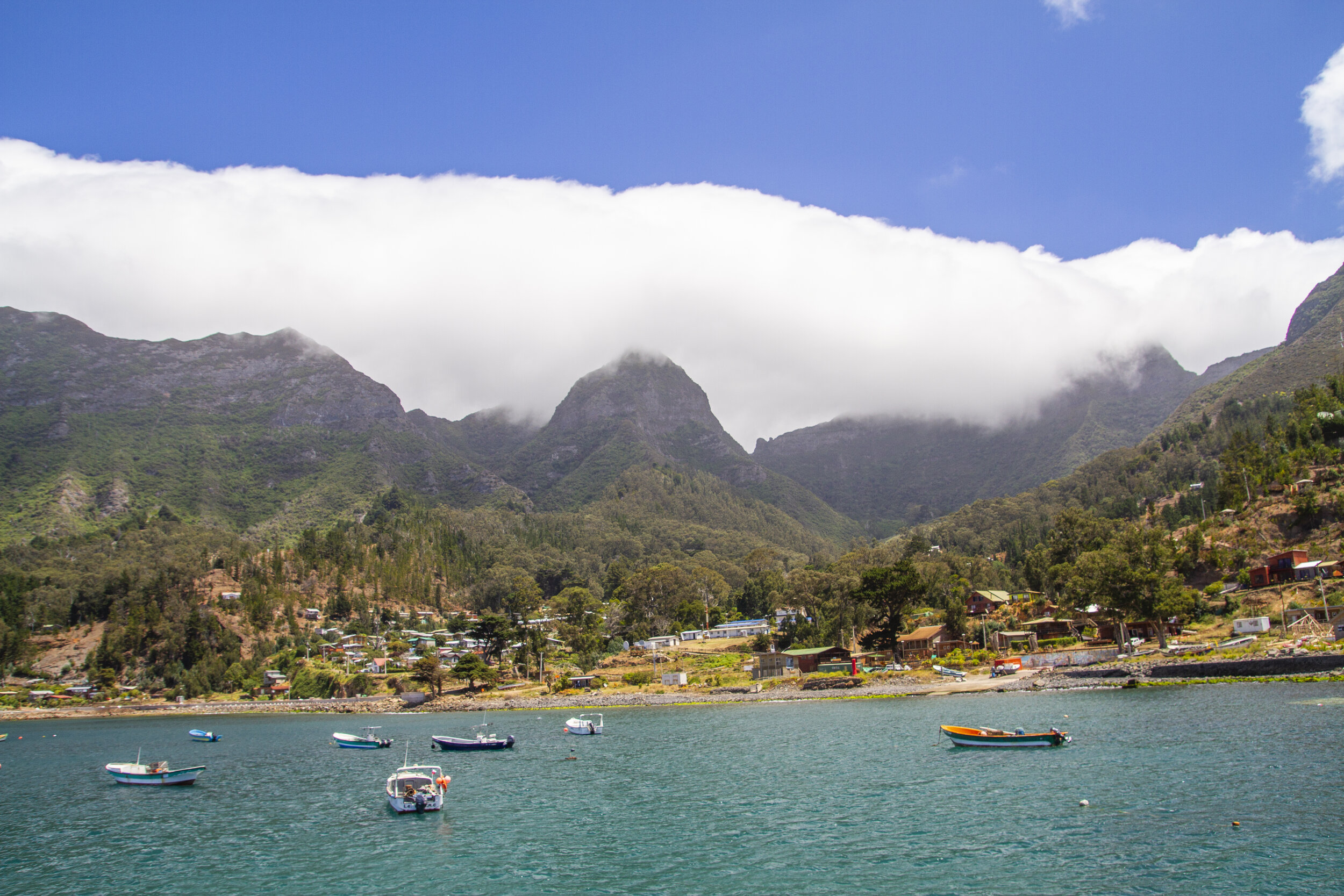
Coastal village of San Juan Bautista on Robinson Crusoe Island, Chile, with cloudy forested mountains behind.

San Juan Bautista, the only population center in the archipelago, on the east coast of Robinson Crusoe with the island’s main ridgeline behind. This coastline has a Mediterranean climate, but essentially all of the island’s native lowland vegetation has been removed or replaced.

One reason for going was my usual obsession with sharp ecological contrasts on islands. Unlike the imaginary one depicted musically in The Last Island, Robinson Crusoe is relatively small and low, covering about 20 square miles and rising to just over 4000’, and so it doesn’t rise to alpine heights; but the topography is dramatic, generating a rainfall gradient from sea level to the ridgetops as well as a striking rain shadow effect across the island’s western peninsula. The other attraction is an endemic palm, Juania australis, very ornamental but notoriously difficult to cultivate. It’s one of Chile’s two native/endemic palm species, the other being the much better-known Chilean wine palm (Jubaea chilensis) from the mainland.

Rare Juania australis palm in lush cloudforest on Robinson Crusoe Island, Chile

A rare specimen of Juania australis in the cloud forest.

Darren Sears selfie with Juania australis palm on a hike throug lush cloudforest on Robinson Crusoe Island, Chile

Me with another palm specimen in habitat.

Unfortunately both of these features of the island, and other aspects of its biological richness (its rate of endemism is higher than that of the Galápagos) are less salient than they once were. Deforestation, invasive plants and animals, fire, grazing, and erosion have greatly reduced the extent of native ecosystems and heavily degraded the pieces that remain. That was especially evident at the eastern end of the island (the area around Cerro Pascua on the map).

Devastated eroded and deforested mountainous landscape on Robinson Crusoe Island, Chile

Panoramic near Cerro Pascua, where a combination of deforestation and runaway fires (lit intentionally, though I forget the reasonI don’t think this area was planted or grazed) has left all of the lowlands and much of the highlands barren and eroded.

Wooden dams in gullies in eroded landscape on Robinson Crusoe Island, Chile

Wooden dams have had some effect on slowing erosion in these gullies.

Rainforest patch in eroded mountainous landscape on Robinson Crusoe Island, Chile

One of the pockets of forest that has escaped the fires.

Rainforest with denuded understory from invasive rabbits on Robinson Crusoe Island in the Juan Fernandez Archipelago off the coast of Chile.

Even where the tree canopy remains, the understory is completely bare and dessicated in most places due to foraging by exotic animals, especially rabbits.

Rainforest relict in an eroded mountainous landscape on Robinson Crusoe Island in the Juan Fernandez Archipelago, Chile

Another forest pocket, in this case cloud forest, clinging to the ridgeline.

Invasive species in degraded forest in mountainous landscape on Robinson Crusoe Island, Juan Fernandez Archipelago, Chile

Large areas of forest have been mostly taken over if not replaced by invasive treesin this view, that includes all of the bright green on the lower slopes (the native trees are more purplish).

That was all very depressing to see. Luckily though, I had an extremely knowledgeable and accommodating guide who made it all very worthwhile and brought me to a few of the more pristine, harder-to-reach areas. One of those is a pocket of relatively intact cloud forest (images following) without an official trail, below another part of the main ridgeline near Cerro Damajuana. (The palm images above are also from this area.)

Tree ferns along hike through relict cloudforest near Damajuana on Robinson Crusoe Island, Juan Fernandez Archipelago, Chile
Top view of relict cloudforest on a hike to Damajuana on Robinson Crusoe Island, Juan Fernandez Archipelago, Chile

You can see a few scattered palms in the lower right.

My visit ended with a roughly six-hour hike between the wet and dry sides of the island, from the town on the east coast to the airport (and my flight back to the mainland) at the western tip. Technically it began at Mirador Selkirk, an observation point on the main ridgeline; the uphill route from town is entirely through exotic vegetation and given the limited time until my flight I traveled it before sunrise. But even across the ridgeline few parts of the overall route have escaped degradation, including what must’ve originally been a transitional dry forest/savanna zone at the lower edge of the forest. (From earlier posts you’ll know that I find ecotones like this to be especially entrancing, but they’re particularly (and for me frustratingly) susceptible to human impacts given that they tend to be both topographically accessible and wet enough to be useful for non-preservation purposes.) But despite this, the contrast between the extremes is probably just as striking as it used to be.

View of the arid western end of Robinson Crusoe Island, Chile, from the cloudforest at Mirador Selkirk.

View across the cloud forest to the arid western tip of the island, from Mirador Selkirk (an observation point) on the main ridgeline. Pockets of the forest ahead are in decent shape but essentially everything behind, from the town up to and including the ridgeline vegetation in the foreground, is exotic. And, like on the eastern part of the island, the bright green vegetation is also not native.

Gnarled tree along a hike through lush cloudforest near Mirador Selkirk on Robinson Crusoe Island, Juan Fernandez Archipelago, Chile

A relatively intact area of cloud forest just below the ridgeline.

Scattered rare Juania australis  palms on ridgeline near Mirador Selkirk on Robinson Crusoe Island, Chile

Looking back at a few Juania australis on the ridgeline, one of the few places where clusters of them have been able to survive (elsewhere it’s just one here and there).

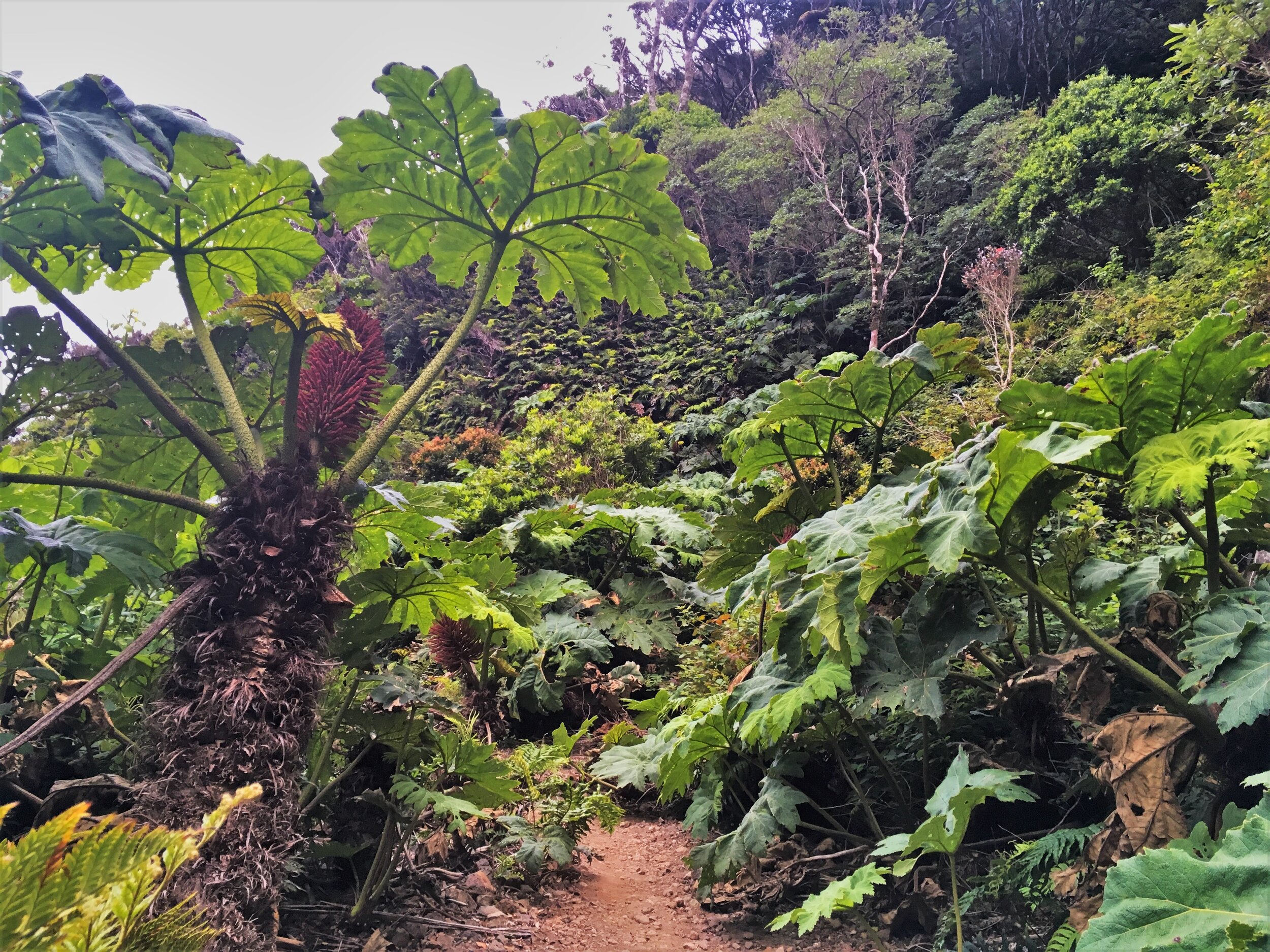
Endemic Gunnera in hike through lush cloudforest near Mirador Selkirk on Robinson Crusoe Island, Juan Fernandez Archipelago, Chile

A bit further downslope, with an endemic species of Gunnera in the foreground.

Dramatic ridgeline and mountains on Robinson Crusoe Island, Chile

Dropping below the forest into (non-native) grassland and ranchland. This zone might’ve been naturally treeless, but was definitely more structurally and biologically diverse.

Ecotone between set and dry landscapes and dramatic mountain scenery of Robinson Crusoe Island, Juan Fernandez Archipelago, Chile

Moving further west as the landscape becomes progressively drier.

Blechnum tree ferns in a dry rocky landscape on Robinson Crusoe Island, Juan Fernandez Archipelago, Chile

A few rainforest species, like these tree ferns, hang on in scattered spots of the dry zone where there’s groundwater.

Dry barren landscape and airport on Robinson Crusoe Island, Juan Fernandez Archipelago, Chile

The hike ends at the airport, in the desert at the western tip of the island.

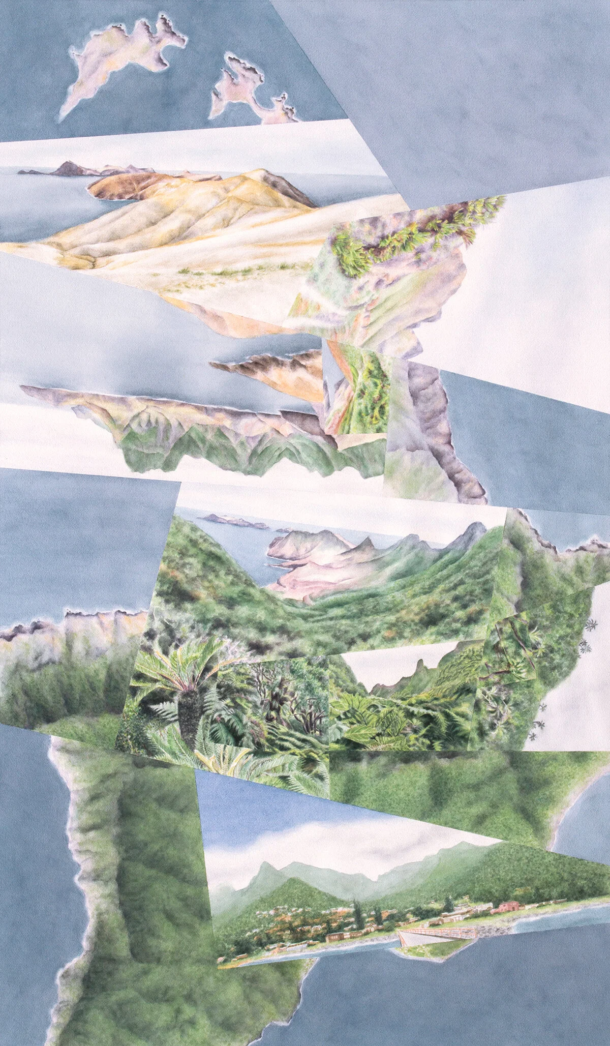
Mirador, the one watercolor so far inspired by Robinson Crusoe, traces this journey from wet to dry (but oriented bottom-to-top). The distinction between intact and degraded vegetation is more ambiguous in paint than in real life, but I do play up what I imagine the landscape might’ve looked like by “restoring” it in places where the difference would stand out. (You might notice that a few of the views borrow from other parts of the island.)

 
Abstract watercolor painting of the rainforest and desert mountain landscapes of Robinson Crusoe Island in the Juan Fernandez Archipelago off the coast of Chile.

Mirador, watercolor on paper, 48”x28.”

 
The journey from wet to dry (bottom to top), animated view-by-view.

The journey from wet to dry (bottom to top), animated view-by-view.

It was interesting to compare impressions from Robinson Crusoe and the Galápagos, in terms of environmental value and situation. Both places have extremely high rates of ecological diversity and species endemism that face serious challenges from human activity. The Galápagos is more famous given its charismatic fauna and its Darwin-associated history, plus the fact that such a high percentage of its environment is relatively pristine (or at least can be perceived as such); if or when its species and landscapes start falling off the edge in ways that the tourists can’t overlook, I know it’ll be a gut punch for me and most people who are conscious of these things. But on Robinson Crusoe I found myself wondering: If or when these last remnants of cloud forest are taken over by invasives or dried out by climate change, how much will that truly matter, to me and to anyone else who’s paying attention? (The island residents themselves seem relatively conservation-conscious nowadays, but they don’t live their lives lamenting what’s already been lost or depressed about what might be to come. Most visitors probably see things the same way, and maybe even most biologists.) There are plenty of other places that are much further gone, and the world has easily moved on….

Darren

Tree ferns on a hike through lush relict cloudforest near Damajuana on Robinson Crusoe Island, Juan Fernandez Archipelago, Chile

Mapping "The Last Island" | Structure

For this fall’s NACIS conference (the North American Cartographic Information Society), I’m proposing a talk along the lines of the ideas I introduced in my last post—the relationships between musical and geographical space, and what those relationships mean for “mapping” both in parallel. Below is a brief recap of those ideas followed by some of my early experiments in applying them to The Last Island, my orchestral composition that started me down this “musical cartography” road.

Both visual and musical depictions of a geographical/environmental “journey” involve travel through time, as well as through space in the sense that the music “picks up” and plays back characteristics of that space as the sound moves through it just as paint or photography does for the eyes. Last time I used a 3D model (shown again below), incorporating a hypothetical musical version of the ecological journey I’ve depicted in my watercolor Divide, to illustrate this structural relationship. The third dimension is represented by the height of the printed score, and certain musical elements that have a “vertical” component. So the main difference between the two mediums isn’t that music is temporal while painting is spatial; it’s that the musical journey is completely “directed,” a one-dimensional path that winds through two dimensions whereas the path of even a “linear” visual journey is itself always 2D to some extent.

Obviously I’ve had a long interest in these journeys generally, which has led to most of my latest worldviews plus most recently The Last Island (which became a multi-media project but began as a solely musical representation of an imaginary island ascent). I’ve been experimenting with methods of “mapping” the piece along with the visual/geographical elements that it’s meant to evoke, in terms of both overall structure and more detailed elements. The goal, both for my own enrichment and possibly for this conference talk (if my abstract is accepted!), is to find out 1) which of those methods best illustrate how the different elements of each medium shift along the journey, and 2) how well those shifts parallel each other given that I wrote the music without the intention of lining it up with any visual imagery. The results aren’t very digestible yet, and so this post is mostly a way to mark some progress and to give an overall sense of how cartographic/design thinking might be applied to music in a very methodical, detailed way. I’ve been working on a series of diagrams (“linear maps”), a selection of them shown in the image below. Skip down to that if you’d like just a quick sense of what I’ve been up to, taking from it what you will, but keep reading if you’d like to get a bit more deeply into the weeds with me….

Overall Setup

Analogous to the 3D model from last time, the sheet of diagrams aligns environmental, painted, and musical elements built up upon each other in that order. Though I broke the rules by adapting the painted elements to the music rather than the other way around, you can think of this ordered layering as representing an “order of operations”: environmental elements (in this case imaginary) inspire the painted representation which in turn inspires the musical representation. (Given the length of the diagrams I’ve oriented the image vertically; from here on I’ll be referring to top, bottom, left and right as if you were looking at the sheet horizontally).

So why no 3D model this time? As I explained last time, The Last Island doesn’t actually lend itself so well to a 3D representation, given that a 2D visual version (a painting/worldview) of that particular island journey doesn’t exist—I can’t show it as a curvy visual/musical path through 2D visual/geographical space. Instead the visual component is just a linear sequence of images taken from many different worldviews, strung together after the fact for the multi-media video, representing a straightened-out and “deconstructed” version of what would otherwise be that curvy path. Technically I could still build a 3D model using that linear sequence—it would just be a very skinny 2D “plane” without any meaningful component of width—and I might still end up doing that at some point in order to clearly distinguish between horizontal and vertical and for another reason I’ll mention below. But since I haven’t done that yet, note that on the sheet:

  • The environmental elements in the bottom half, like the painted elements, are each represented by linear bands. In a 3D model they would each appear as a different component of that skinny horizontal 2D plane, separated out. (It would probably take multiple models to illustrate clearly.)

  • The bands representing musical elements are abstractions of the printed musical score— components of the vertical dimension in a 3D model (like in the generic example from last time), separated out.

Musical map of The Last Island, composition for symphony orchestra representing the ascent of an imaginary tropical island.

Environmental Elements

These include the following from bottom-up, arranged to represent a sort of (very simplified) “order of operations” like I described for the sheet overall:

  1. Elevation

  2. Rainfall (a function of elevation)

  3. Heat (also a function of elevation)

  4. Tree Cover (a function of heat/rainfall). I could’ve also called this “biomass” or “plant density”; if I were being scientific about it I’d probably break it into several different elements.

  5. Landscape (or ecosystem; a function of all the above). I’ve divided this into “foreground” and “beyond,” applicable to the painted images that include a view into the distance or represent a “mental detour” (more on that later). Though I haven’t labeled it on the diagrams, all of the elements above also incorporate these “foreground” and “beyond” components where applicable.

Painted Elements

Each individual landscape in the sequence of paintings is sized according to its duration in the video. This does make most of them too small to read—you’ll just have to watch the video again!—but it’s the result of equal space intervals representing equal time intervals. (If I ever turned this sequence of images into a 2D worldview I would need to consider whether to size them in the same way relative to each other—in the watercolor compositions I do typically size the fragments based on their psychological “salience” but there are many more factors involved than the amount of time “spent” in each landscape. This also raises the issue of this being way too many images to fit into one painting; it’s another result of having put the imagery together after-the-fact, wanting to make sure the video imagery keeps moving.)

Musical Structure

I’ve labeled the two music-related diagrams as musical “elements,” though they aren’t elements so much as larger components or devices that organize other elements within.

  1. Paths. I mentioned that music, unlike visual representation, restricts experience to a single path through space (and of course time). And though that 1D path may wind through 2D space, in the case of the The Last Island that “space” is also just a 1D (linear) strip of imagery. But as I began to ask in the previous post, could multiple musical paths progress at the same time, evoking 2D space even if each path is itself straight/linear? What if The Last Island didn’t just depict one journey but two simultaneous journeys, or—more nuanced—one journey that jumps back and forth between two (or even more) different paths, suggesting a physical journey interrupted by “mental detours” to another place? Or more accurately, a mental journey (since none if this is really “physical”) interrupted by “meta-mental detours”? (This all raises of who is actually doing the “journeying”—is it the listener or is it someone imagined by the listener? Or multiple someones in different places? I won’t get any more caught up in this now, but I think it’s either a fascinating question or a silly one.)

    I didn’t think about this idea of multiple paths in a very methodical way while writing The Last Island. But there are certain zones where, based on sufficient “divergences” in some combination of elements (key, register, instrumentation, pitch, and possibly others), parts of the score could be thought of as splitting off from the rest to evoke a different place. Generally that place is actually forward or backward on the same path, suggesting the imagining of places to be visited (anticipation) or places already visited (memory), rather than a different path “off to the side.” But I think that’s overthinking it (if all of this isn’t already over-thinking); the concept of spatial “thickness” is the same.

    In the Path diagram, these anticipation/memory “detours” are represented by the light rows of arrows, and the divergent paths are in dashed boxes. Sometimes those paths are made up of certain layers in the score, and at other times all layers; the mind is either partially or completely “wandering.” The heavy dashed lines show how these “tears” in the path align with parallel shifts in the painted and environmental elements. Picture the paths in the dashed boxes as receding into background, and the painted/environmental elements between the dashed lines as shifting over, per the horizontal/vertical distinction I had to clarify earlier given the lack of a 3D model. (This is the case I alluded to where that model would have been useful.) Also note the lighter dashed lines and darker rows of arrows labeled “view ahead.” These demarcate distant places, again forward or backward, that are actually visible from the main path so that they don’t require “mental detours” of the same degree. In these cases there’s no break in the path.

  2. Theme. Writing The Last Island based not on a particular worldview, but still inspired by the idea of environmental edges and contrasts along a journey (rather than continuous, imperceptible change), I divided the piece into into discrete sections each identified by one of two themes defined mostly by melody (a combination of pitch and rhythm) but with a harmonic component as well. The choice of two themes, rather than a different one associated with each successive ecological zone, frankly had a lot to do with having had two pre-conceived themes already in my head; but, it also meshed well with my interest in the wet-dry dichotomy in particular. With that starting point, and at the same time also wanting to depict the more ecologically complex experience of an island ascent, I landed on the idea of “mental detours” and distant views that I described above: “traveling” psychologically back-and-forth multiple times between dry (Theme A) and wet (Theme B) places in the midst of an “actual” linear journey inland and uphill. It’s that underlying, continuous inland/uphill journey that makes the themes different each time they return, inflected or overlaid by any number of musical elements that evolve through space and time without obscuring the thematic identities.

    These musical “zones,” defined by clear edges and contrasts, then informed a largely parallel ecological zonation pattern in the sequence of images, and in turn the diagramming of ecological elements that would produce the landscapes in those images. Again, this inspiration went in the wrong direction and I didn’t write the music with the intent of slavishly adhering to a visual or physical precedent. That’s why the boundaries between thematic and ecological zones don’t always line up. It also explains, partly, why from about 7:30 onward the association of Themes A and B with dry and wet respectively breaks down. But there’s a conceptual justification too. Aligned with the dry forest zone between about 6:30 and 7:30, transitional between dry and wet, the two themes overlay and become confounded in the process, losing their respective dry and wet associations for the remainder of the piece.

More updates on this “mapping” process to come soon….

Darren

Musical Time & Space

I still have a few more posts to add to my “long gradients” series—moving on to the experiences of other patterns and places, since I think I’ve said all I have to say for now on how they might be represented photographically or otherwise. But having recently finished my orchestrated version of The Last Island (click the image to the left and then hit play on youtube if you haven’t had a chance to watch/listen yet!), and toying with the idea of proposing it and “musical cartography” more generally as subjects of a talk for this fall’s NACIS conference, I’m taking a break from long gradients to write a few music-oriented posts. I’ll wait till the next post to focus on The Last Island—how I structured the piece based on spatial ideas about the geography it evokes as much as my relatively limited musical composition/theory training. The post you’re reading now will be more theoretical, thinking about a general framework of how musical, visual, and geographical space interact. While it might turn out not to have much bearing on the next post, it’s been necessary for me to work through that thinking.

The purpose of these two music-themed posts is mainly to organize my thoughts and possible ways of presenting them, and to get a sense of the ideas’ potential from my own perspective and also maybe yours. I know these recent musings have been on the drier, academic side—frankly I’d never intended to shy away from that sort of thing in this blog—but don’t worry, imagery from incredible parts of the world will soon make its way back into the mix!

Musical vs. Physical Space

I’ve often thought about how musical “space” relates to physical space, whether the latter is three-dimensional (the “real world”) or two-dimensional (maps, photographs, and other depictions). At first thought music as a medium seems distinct in that it relies on the temporal dimension—music couldn’t exist if time stopped. But if you think about it a bit more, this apparent distinctiveness isn’t right: Your visual (or tactile, olfactory, etc..) experience of a place, or of a visual representation of that place, is no less about the passage of time than a musical representation of that place would be. Hiking in the Grand Canyon, standing still at the edge of the Grand Canyon while exploring it with your eyes, or exploring a photograph of the Grand Canyon with your eyes are all essentially equivalent to “exploring” it by listening to Grofé’s Grand Canyon Suite—all are explorations that have duration, just made using different senses. These different modes of exploration are also tied up in Mussorgsky’s Pictures at an Exhibition, inspired by the composer’s ambling through an art gallery. His physical act of walking, the movement of his eyes over each painting, and someone else’s listening to the piece are all parallel or intermingled temporal experiences (though the musical version likely condenses or extends the duration of the physical experience).

Of course the physical, visual experiences of the Grand Canyon and art gallery do have crucial spatial aspects, in 2D and/or 3D, that the musical experiences don’t. But music does have spatial components, whether that’s the physical 3D space of a concert hall or the 2D form of the printed musical score. Those are obviously different things than the 3D canyon or gallery, or 2D paintings of the canyon or in the gallery. But being the over-thinking person that I am, I was interested in figuring out how these different types of physical form and space “line up,” in the same way that the progression of time in listening to a piece of music corresponds to the time taken to experience a physical place or visual representation of that place.

The rest of this post will address this question with regards to a particular real place that I’ve talked about before (the island of La Gomera in the Canaries), the visual representation it inspired me to create (Divide), and a hypothetical musical composition inspired by my experience of that visual representation and in turn by the real place. The Last Island—even though it incorporates a musical composition I’ve actually written—wouldn’t work for laying out this theoretical framework because the imaginary island it’s based on doesn’t exist in the form of a map/worldview.

Aerial photograph of La Gomera, Canary Islands (Google Maps).

Aerial photograph of La Gomera, Canary Islands (Google Maps).

(Psycho-) Geographical Space

If you ignore the vertical dimension (elevation/altitude), the two dimensions describing the “real” island of La Gomera are of course length/distance—whether that’s degrees of latitude and longitude, meters, or some other unit. Together these dimensions form “geographical space.” Within that space an infinite number of environmental elements—elevation (as measured by contour lines), temperature, precipitation, species composition, etc…—that vary with distance can also be measured. An aerial photograph of the island, no matter how “accurate,” is technically a map—it leaves out tons of information, makes “decisions” about color and the like, and is a flat representation of the earth’s curved surface. Even your view of the island from a parachute would be a mental map of the place—your eyes and brain would be making various decisions and distortions. But since the goal of the image isn’t to reflect human prejudice or experience, think of it here as representing “the real place.”

Divide (watercolor on paper, 20”x20”)—a spatially-distorted re-imagination of La Gomera’s geographical space.

Divide (watercolor on paper, 20”x20”)—a spatially-distorted re-imagination of La Gomera’s geographical space.

Divide, though, is fully intended to be a distortion of the real thing, and of course I’ve very intentionally been calling it and my other worldviews (my views of the world) maps. Not only has the geographical space of the island been re-imagined in painted elements (added to the two axes in the diagram) correlating with the distribution of environmental elements; that re-imagined space is no longer fully linear, as indicated by the crooked arrows. Essentially each landscape view/“fragment” takes a single vantage point and blows it way up, roughly proportional to its importance in my mind based on how I experienced that spot in real life. The work is a physical map, representing a mental map of the island that’s been highly inflected by memory, preferences and value judgements, and the places I happened to visit when I was there. Geographical space has actually become psycho-geographical space—it sounds like academese but it really just means physical space that’s become distorted in the mind and then on paper by experience. (Technically all space is like that, but again I’m focusing on intent.)

Divide with path of travel overlaid in red, and the different views numbered in succession. Note that in this case travel can go in either direction.

Divide with path of travel overlaid in red, and the different views numbered in succession. Note that in this case travel can go in either direction.

The psycho-geographical space of Divide with “musical elements” incorporated into the two axes, adding a musical component to the route of travel through time (and space). Below I’ll say more about the musical elements themselves and what I mean by …

The psycho-geographical space of Divide with “musical elements” incorporated into the two axes, adding a musical component to the route of travel through time (and space). Below I’ll say more about the musical elements themselves and what I mean by “horizontal.”

“Travel” Time (& Space)

Now I’ll get back to the issue of time—the temporal dimension of experiencing/representing a place whether musically or visually. I’ve described before how in many of my worldviews the eye and mind are meant to “explore” the places I depict in roughly linear “journeys” paralleling how I explored and remember the real locales. Though a viewer’s eyes won’t automatically follow the path I intend them to, as you’ve seen I often take the opportunity to highlight the route I had in mind when creating the work. On La Gomera and in Divide that was a generally north-south journey across the island from wet to dry.

A hypothetical piece of music, playing out in time to evoke the spatial but equally temporal experience of exploring some aspect La Gomera, could trace the same journey as the dotted red line (or a different one for that matter). In that case the visual (painted) elements, and in turn the environmental elements that vary with distance in geographic space, would be correlated (in some way that’s been chosen by the composer) with musical elements that evoke those spatial variations. Of course these musical elements don’t really “exist” in that 2D space in a meaningful way except along the travel route, where a musical composition would essentially bring them into being and to our ears. Everywhere else they exist only as potentialities—options “out there” for the composer to select where (and when) they intersect with a chosen musical path through time and space.

If it’s thought of as a musical in addition to visual journey, that path needs to run in just one direction (unless you do some fancy things with a recording). And to make it more comparable to The Last Island (in ways you’ll see later) I’ve also added the aerial views into the sequence of experiences and extended the route to double-back on itself and return northward to the wet part of the island, importantly not suggesting part of a physical journey but rather an imagining or reminiscing.. So this end part of the journey would be purely psychological not just for the viewer-listener but also for someone physically traveling the earlier part of the route.

Musical Elements, Horizontal & Vertical

So what are these “musical elements”? I haven’t done enough research to know whether there’s considered to be a “correct” breakdown or if one is even possible. But for my purposes now and especially the next post, I’ve made an attempt at a categorization that can inform an analysis of musical “spatiality” or “dimensionality” in general and in relation to how I’ve composed The Last Island. I’ll get more into it next time (they may now seem like somewhat arbitrary distinctions and divisions), but essentially I think of those elements as tempo, duration (incorporating rhythm and articulation), key (key change and duration, and key “mood” or “brightness”), pitch (range, diversity and register), instrumentation, voices (the number of different musical “lines” playing simultaneously), and dynamics (volume). There’s also the broader concept of motif or theme, corresponding partly but not entirely with “melody,” which is inflected by these other elements. Motifs, inflected in various ways, can be used to structure a musical composition into sections or “zones” just like environmental elements can be organized into ranges that structure a place like La Gomera into temperature, precipitation, or vegetation zones on an ecological map, or as I’ve done with the landscape fragments in Divide, “experiential” zones.

To better organize my thinking I’ve classified these seven elements (putting motif on a higher level) into four general categories that include various combinations and aspects of the elements:

  • MOTION (tempo, duration, key, pitch)

  • TEXTURE (duration)

  • COLOR (duration, key, pitch, instrumentation)

  • WEIGHT (voices, dynamics)

These aren’t perfectly distinct from each other and like the seven elements I don’t claim they’re “correct,” but in the process of working through my thinking they have been holding stable—some indication that they aren’t arbitrary.

Again each of the seven musical elements can correlate, however the composer chooses, with environmental/visual elements that vary horizontally (as in parallel with the ground, not just left-to-right on your screen) in a 2D representation of the earth’s surface. This means that just as the viewer’s path of travel (like the dotted red line in Divide) through psycho-geographical space passes though various combinations of those environmental/visual elements, a piece of music tracing that same path passes through various combinations of those musical elements that also vary horizontally as the music plays out. This horizontal variation through time and space happens to align with the horizontal dimension of a musical score on the page.

So then what does the vertical dimension of a printed score (or of music generally) represent? I’ve spent some time trying to figure out if there’s any agreement on what can be classified as vertical vs. horizontal components of music, and there doesn’t seem to be. It does seem clear, though, that as on the printed page, these two dimensions have some reality, and that musical elements exist on some fuzzy continuum between horizontal and vertical. Tempo and duration—reliant on the passage of time (and when overlaid on the map, movement through space) for any meaning—are clearly horizontal, but most elements are some mix of vertical and horizontal, and all are horizontal to some degree because by definition they vary over time. Pitches, for example, create various effects through vertical stacking (roughly, harmony) as well as being spread out horizontally on the page and as the piece plays out (roughly, melody, depending on how prominent the musical line is). One way to visualize the difference is through another cartographic analogy. On any map using various colors, values (black to white), or patterns (e.g. lines or dots) to illustrate zones of different elevations, climates, or any characteristic, all those colors, values, or patterns have a flat, “horizontal” component because they fill spaces spread across the page. But only the patterns are dependent on the sizes of the shapes they fill in; a given spacing of lines or dots wouldn’t show up in a space that’s below a certain size, while for color or value it would make no difference. Similarly a one-second snippet of music would probably give no meaningful indication of tempo or note duration but would provide at least a one-dimensional—vertical—indication of pitch or instrumentation. (Of course, just like the space on the map couldn’t be so tiny that the eye can’t perceive its color, that snippet of music would need to have some minimum duration; you can’t eliminate horizontality completely.)

Applying this concept of horizontal and vertical dimensions to my four broader categories of elements, it turns out that motion and texture are purely horizontal (incorporating duration and tempo plus the time-dependent aspects of key and pitch), while color and weight contain aspects fitting into both the horizontal and vertical dimensions. For the sake of space and simplicity I’ve used these four broader categories to label the musical axes, horizontal and vertical, on the diagrams.

Divide again, with a representation of an actual musical score aligned with the path of travel through time (and space). Here the vertical musical axis has been added in, and the horizontal axes are now more literally horizontal (lying flat). Note t…

Divide again, with a representation of an actual musical score aligned with the path of travel through time (and space). Here the vertical musical axis has been added in, and the horizontal axes are now more literally horizontal (lying flat). Note that this vertical axis has nothing to do with a vertical visual or environmental axis (representing, say, topography)that’s been compressed into the 2D painted representation.

I pointed out earlier that the musical elements could be considered to exist throughout 2D (horizontal) space as potentialities, waiting to be picked up by a composer’s “path of travel” through it. Now that I’ve shown how an actual musical score fits into the 3D system, you might ask if there could be any printed musical equivalent to the horizontal 2D plane. For traditional music I think the answer is no. But there are contemporary scores, like some by John Cage, that are meant to be read and performed like “maps.” They’re collections of marks, often without any connection to standard musical notation, arrayed across the sheet like an abstract painting. The idea is for the performer to produce whatever sounds they evoke as the eye wanders across them in no particular direction. You could say that the marks represent these potential musical elements waiting to be picked up, with the route of “travel” created in real time rather than in advance. So what would the vertical element be in this case? I think that each mark would have its own vertical component, represented by dynamics and other aspects of the various elements as I explained above, but this would not be part of the score itself—unless the composer wanted to try somehow scoring the piece in 3D. You could also imagine multiple copies of the “map” layered vertically, each taken by a different performer; that would create multiple “routes” winding through the 2D space, layered vertically.

Multi-Media: Combining the Visual and Musical for the Listener

This whole idea of aligning musical and visual journeys on an actual map of some sort (in Pictures at an Exhibition it would be a map of the art gallery) raises the question of how visual imagery could be integrated into the act of listening to music meant to evoke a spatial journey (whether it’s a recording or a live performance). The Last Island combines the orchestral sound with an animation of still images representing the visual component of an imaginary island ascent, though as I mentioned in my last newsletter I do plan to explore other means of integrating the visual and musical media. Theoretically something like the 3D model above could be part of a presentation/performance if the viewer-listener could “fly though” it virtually as with digital architectural models.

The idea that you might use the model as part of the work/performance rather than just an explanatory tool also makes me wonder if there could be more creative possibilities for depicting the musical path itself. One might be making the path discontinuous as I’ve shown in the modified model below, if pieces of that journey are “psychological detours” like the extended end of the La Gomera path where the mind can jump around on the map however it wants. Another could be designing the journey to pass through multiple parts of the map simultaneously, along parallel paths or branching paths. That would represent, say, half the orchestra evoking one place while the other half simultaneously evokes another. The Last Island does that in one spot (sort of) as you’ll see later, but a more established example might be Borodin’s On the Steppes of Central Asia which actually was part of my inspiration for writing The Last Island. The piece is built on two melodies, one representing a group of Russians and the other a group of Mongols as they approach and then pass one another on the steppes. The melodies first alternate, then are played simultaneously. I can imagine somehow modeling this as two separate musical/visual paths of travel on a map, flowing in opposite directions through time and space.

A modified musical route through Divide, with the gap and disjointed piece at the end evoking a mental “jump” back in the direction already traveled.

A modified musical route through Divide, with the gap and disjointed piece at the end evoking a mental “jump” back in the direction already traveled.

But since The Last Island, for the time being, relies on animated still images to accompany the music, for a smooth segue between this post and the next one I’ve translated my hypothetical musical depiction of La Gomera into a similar sequence of still images:

Divide deconstructed into individual views (numbered at the bottom per the map) that could be animated to accompany the hypothetical musical composition as in The Last Island. The two horizontal axes from the model and maps above, representing psych…

Divide deconstructed into individual views (numbered at the bottom per the map) that could be animated to accompany the hypothetical musical composition as in The Last Island. The two horizontal axes from the model and maps above, representing psycho-geographical space, are here merged into a single axis that still incorporates both musical and visual (painted) elements. Those elements vary in tandem as the listener-viewer travels forward through time (and space) in the direction of the dotted red arrow representing the straightened-out travel path from the map/worldview. The vertical musical axis stays vertical, aligned with the score. All the arrows have become straight lines because geographical space here is one-dimensionalitself more of a path than space.

So that’s the theoretical framework, again mostly for the sake of getting it laid out in writing and in front of some eyes other than mine. If you’ve gotten this far and particularly if you have musical or cartographic leanings, any thoughts on whether it’s 1) intelligible and 2) interesting (maybe it’s all common sense once you think about it?) would be greatly appreciated!

Next time I’ll go into how my vision of the journey depicted in The Last Island drove my arrangement of the various musical elements in the orchestral composition.

Darren

Long Gradients | Transects (cont.)

In my last few posts I described how the most promising way of capturing and “compressing” long gradients (ranging over hundreds of miles) in temperature or precipitation would be a photographic transect made up of ground-level views shot at even intervals along the gradient and arranged in a sequence. I’ve mentioned that to add interest, clarity, and context, that sequence could be complemented by additional types of imagery. Here are some more thoughts on what that larger display might include:

  1. The photo-transect itself, combining enough views to create an “average” picture of the gradient that outweighs local irregularities. This could be anywhere from a few dozen to a few hundred views depending on the length of the gradient (a few hundred to a few thousand miles) and the size of the interval (say between 1 and 10 miles).

  2. A baseline—the first image of the transect repeated over and over, “measuring” the gradual change in the transect that would be otherwise imperceptible photo-to-photo. For example each image in a rainforest-to-desert transect would be aligned with the initial rainforest image.

  3. Gradient milestones marking significant moments, like the first appearance of a certain species. It would take the form of a single image here and there aligned with its location in relation to the transect. Those images could be duplicated images from the transect, additional images where the transect interval or route happens to miss those locations, or a combination.

  4. A very, very long overall aerial photograph with the route of travel highlighted.

  5. Zoomed-in aerials—enlarged portions of the overall aerial—each aligned with each image in the transect (essentially an aerial counterpart to each transect image).

  6. Data, like graphs showing spatial changes in temperature/precipitation or the ranges of various species along the gradient.

Diagrammatic exhibit incorporating a photo-transect (in this case along a precipitation gradient) with supporting imagery, numbered according to the above outline. In actuality it would be much, much longer.

Diagrammatic exhibit incorporating a photo-transect (in this case along a precipitation gradient) with supporting imagery, numbered according to the above outline. In actuality it would be much, much longer.

In the process of writing these posts I’m coming to the conclusion that if I ever do have a chance to document one of these long gradients more methodically, this approach probably wouldn’t be very engaging to someone not already interested in the subject. Aside from being challenging to create and then fit onto a wall, the result would probably be information overload. I’m not intending it to be artistic—it would be more along the lines of something you’d see in a design exhibition—and that might be the problem. I’ve explained why the “fractured” style I use to represent short gradients wouldn’t work in this case, but I think I might need to sacrifice some subtlety to move back in that more creative direction.

I’m confident that some version or subset of the outline above can be made to work—all that information could be useful in some form. But I thought I’d mention a different kind of “measure” of these gradients which could still capture the subtlety of the gradient while mostly avoiding the subtlety and complexity of vegetation as a measuring device: built form. On this past winter’s cross-country road trip the idea occurred to me to use Google Maps to count the frequency of rectangular vs. circular farm fields in a band along the highway, as an indication of increasing aridity traveling east to west (the two forms use different methods of irrigation). You can observe and quantify the presence or absence of a certain built/designed element much more easily than, say, a tree species that can vary in size and health (should the first instance of a species count as a “milestone” if it’s just a seedling or if it’s half-dead?). The choices are discrete, if not binary. There are a number of other built elements, material and stylistic, responding to temperature or precipitation that could be quantified in this way. On the trip I also noticed that at some point in Oklahoma, stone or brown-painted highway overpasses started replacing green-painted ones. I wasn’t paying full attention and so I’m sure there were more bridge designs than that, but the fact remains that they’d be relatively straightforward to categorize and count. This type of documentation wouldn’t necessarily require a photo-transect at all, probably just an aerial image overlaid with symbols: The sense of immersion provided by on-the-ground photography would much less important to conveying building patterns than conveying vegetation patterns. (And in some cases the counting itself could be done with satellite imagery or Google Street View rather than all that field work.) It still wouldn’t be a work of art, but it would be more manageable in every way.

A wet-dry gradient illustrated by quantifying the frequency of rectangular vs circular fields, represented respectively by blue and red dots on an aerial photograph. (Satellite images from Google Maps.)

A wet-dry gradient illustrated by quantifying the frequency of rectangular vs circular fields, represented respectively by blue and red dots on an aerial photograph. (Satellite images from Google Maps.)

In graduate school, reviewing a proposal (ultimately unsuccessful) I’d written to create one of these photo-transects, a professor noted a particular tunnel through the Alps that acts as a dividing line between “northern” shingled roofs and “southern” tiled roofs. If the boundary really is that sharp, then it actually represents a “milestone” along a temperature/precipitation gradient that’s certainly more gradual even if the climates on either side of the mountain or ridgeline above that tunnel are distinctly different. As with a vegetational milestone, that would be especially powerful—the boundary would distill and compress a much more subtle climatic gradient into a clear, single line.

That should wrap up my thoughts on representation for the time being—next time I’ll have more to say, and show, on other long gradients around the world….

Darren

Long Gradients | Time Travel

In this discussion of long gradients, I’ve been talking about “compression” in spatial terms—photographically representing continent-scale vegetation patterns within the space of a few feet of wall. But this compression is essentially about time rather than space—the many hours needed to experience the real-life gradient by vehicle versus viewing a photographic transect in the “space” of a few seconds or minutes. And as I mentioned in my introductory post on the topic, even the car trip version, if relatively speedy and uninterrupted, can have a miniaturizing effect, needless to say compared to doing it over weeks on foot. I sometimes wonder if, when cars and trains first came about, the average person found this to be one exciting aspect of the new technology. (I’m sure geography- and botany-minded people did.)

Airborne

This idea of compression-through-speed might also raise the question of why flying (at least for me) doesn’t produce an even stronger compressing effect than driving. I think flying does give most of us a surreal, world-shrinking feeling in the sense of going to sleep over one continent and waking up over another. But I’m referring more specifically to what’s happening on the ground in-between—it isn’t the same as theoretically traveling by land at the speed of a plane. But, going back to photo-representation, what about a transect from photos taken from a plane, requiring many fewer images than if shot from a car? Or, for that matter, satellite views like those of the central U.S. that I posted earlier? Those visuals would be lacking something too, for the same reason my worldviews nowadays are fractured into landscape and aerial perspectives rather than just the latter: The compressing, empowering effect depends greatly on an earthbound, immersive experience. Detachment from the ground changes it qualitatively.

But having said that, I’d guess that early astronauts’ captivation by their first views of earth from space was not just a new realization of the planet’s fragility but a feeling of omniscience—“complete knowing.” (As I’ve talked about, my worldviews actually grow out of both those feelings.) An airplane, despite affording a much narrower view of the earth moment-to-moment, does provide some degree of that omniscience; at the same time it remains relatively “earth-bound” in comparison to a spacecraft, plus more closely bound to the typical human experience. All this has been in my mind for a long time, and so on a cloudless flight from D.C. to San Francisco in 2016, somewhere over Kansas it occurred to me to attempt a photo-transect from the air. For the remaining three hours I took a picture every two minutes, an interval that left no gaps and produced only a small amount of overlap between views.

The flight path and photo locations, produced in Lightroom. Each number on the orange rectangles represents the number of photos taken near that spot (they’re grouped together only because I’m zoomed far out).

The flight path and photo locations, produced in Lightroom. Each number on the orange rectangles represents the number of photos taken near that spot (they’re grouped together only because I’m zoomed far out).

Photographic transect from wet to dry landscapes of the western united states of america taken from an airplane window.

The photographic transect (from upper left to lower right) along the flight path in the map above. If I hadn’t made this for screen viewing I would’ve arranged them in a single rowor maybe, now that I’m seeing it, the stacking doesn’t necessarily muddle the effect?

The clouds did mostly stay away for the rest of the flight, but given the iffy lighting and the fact that I started the project already halfway across the country, the result turned out to be of limited value in terms of capturing the wet-dry gradient. Yet I think it’s effective just in showing how many images like this it takes to seamlessly cover half the country, and there is a compressing effect in that being fewer than I would’ve expected. The lack of gaps between images does in one way give it more impact than any remotely practical earthbound transect could. And, again, it beats even a single, seamless view from space because of that closer connection to earthly experience. If I ever manage to end up on another daytime, cloudless, trans-continental flight with a window seat away from the wing and a better phone camera, I might try it again.

There could be a few ways of splitting the difference between slow-and-earthbound and fast-and-airborne, in terms of the real-life experience of traveling the gradient as well as a photographic transect that you could create from that journey. One is high-speed rail, which I haven’t ridden in years but can imagine could be the best of both worlds (maybe across China, which has a similar forest-to-desert gradient as the U.S.). Another comes from a documentary I saw when I was young about the “African Flying Boat”—a low-flying plane used by the British Empire to link its colonies. My memory’s probably distorted but I recall that it flew just above the treetops. There are probably good reasons why it isn’t still around, but I remember being entranced.

Animated

So, there are factors other than speed—particularly “groundedness”—important in creating a compressed experience of gradients whether out in the real world or through some form of representation. But in terms of representation, the issue of temporal vs. spatial compression brings up a second question: instead of a hard-to-display photographic transect, why not a video? I think the answer is that, even though a photo-transect on the wall would still take some amount of time to take in, video is by definition a time-based medium no matter how long it runs. Theoretically a photo-transect could be absorbed in an instant, depending on how far back you’re standing. My mental image of a thousand-mile distance being compressed and then “laid out” spatially is much more powerful than a sped-up version of traveling that actual distance. (It reminds me of another image, stuck in my head from A Thread Across the Sea by John Steele Gordon—1,000 or so miles of future trans-Atlantic cable coiled up—compressed, in its own way—in the hull of a ship.) But a video could be much more practical to display, and even though temporal duration is a problem regardless of what that duration is, you can always try speeding it up. So I decided to give this a try too, though in this case along a short gradient: rainforest to alpine desert on the first half of my 2011 Kilimanjaro ascent (7,700’ to 13,500’).

Video transect of a hike ascending Mount Kilimanjaro from rainforest to snowy alpine landscapes.

This 2.5 min. video from my Kilimanjaro climb (the Lemosho Route) is really an animated photographic transecta succession of still photos (taken at about every 50’ of elevation gain) laid out in time rather than in space. Shooting continuous video would’ve been barely possible, not to mention a bad way to experience the climb. Plus, along a short, elevational gradient, variations in slope mean that continuous shooting wouldn’t accurately capture vegetation changing in response to elevation.

For a long gradient the frame interval would be based on distance rather than elevation—definitely a much larger distance than the average distance covered between each of the frames in this animation, meaning that the total number of frames may or may not be larger.

I also made a second version of this video with much shorter frames—it’s basically a 17-second green-to-white blur.

Video transect of ascent of Mount Kilimanjaro from rainforest to snowy alpine landscapes.

The Kilimanjaro ascent, accelerated.

Though I might’ve gone overboard with the speed in this accelerated one, I do think it’s more effective than the slower version in encapsulating the gradient. But because of the aforementioned benefits of “laying it out,” of wanting viewers free to absorb it at their own speed, and of my interest in the challenge and novelty of making it legible, informative, and displayable, I still think the non-animated transect idea has more potential. Next time I’ll have some final thoughts on possibly where and how, for long gradients.

Darren

Long Gradients | Photographic Transects

Last time, using the example of my recent road trip from California to Maine and back, I delved into the topic of long gradients—spatial changes in vegetation, such as from wet to dry or temperate to tropical, only visible across many hundreds of miles and not mainly the result of elevation change. These gradients are harder to take in than the much more compressed variety (generally elevation-driven) that I usually focus on, but for me the fact that the climatic forces producing long gradients are essentially invisible compensates for the overwhelming scale and gives these gradients a similarly empowering, “world-shrinking” effect.

For years I’ve been thinking about how to depict gradients like this—in a way that makes them easier to experience than through many hours on the road but somehow still communicates their large-scale reality, since it’s the very fact of this compression that would give the representation its power. My typical method of representing small-scale gradients—fracturing them into a handful of scenes and juxtaposing them to sharpen the contrasts between—wouldn’t be ideal for larger-scale patterns. Those fractured compositions wouldn’t be able to incorporate enough pieces to convey the nuance of fine gradations without becoming impossibly long and narrow. Plus, there’s a point at which this sort of depiction moves beyond the realm of aesthetics and more firmly into photo-documentation. Making it visually interesting would still be important, but it would need to be composed in a way that’s more methodical and less about creating pleasing geometries.

The most obvious method would be a linear sequence (a transect) of photographs taken at even intervals along the gradient. I made a very non-methodical attempt at this during the westbound leg of the road trip —more on that below. The closest I’ve come to a methodical version is instead along a short, elevational gradient—on Santa Cruz Island in the Galapagos, about 600m of rise across a 20km distance (shared in an earlier post about that island.) I felt that this was only minimally successful. One reason is that the result, below, has limited legibility without dramatically enlarging it; another is that, keeping a constant interval of roughly 30m of elevation gain between photos, many of the views end up capturing anomalous conditions that aren’t very representative of the gradient as a whole. It also raises questions about where to stand, which way to point the lens, and how much to include in each view. In particular, if travel is by road, asphalt tends to fill up a large percentage of each frame.

Photographic transect across northern half of Santa Cruz Island in the Galapagos from arid coastal zone to wet highland zone.

A photographic transect across the northern half of Santa Cruz Island from the arid coastal zone into the wet highland zone (traveling from bottom to top, north to south).

A transect down a long gradient would face these same issues of interval, vantage point, orientation, and extents, but magnified. Focusing on the issue of intervals, based on distance rather than elevation: there would need to be enough images to capture the typical condition of a given zone of the gradient, accurately conveying the overall rate of change. But “accuracy” depends on how fine a grain you’re talking about. Zooming out, the rate might look relatively constant, but zooming in, it increasingly won’t, as discontinuities (or “anomalies”—elements that seem misplaced) become more prominent. Even if the overall climatic gradient from wet to dry or cold to warm is relatively smooth, variation in local conditions like soil, topography, or moisture, and randomness in weather events or seed dispersal, create patchy distributions of species. Zooming in far enough, islands and edges overwhelm gradual transitions, resulting in what I think of as “tension zones”—areas of extra rapid change—and “milestones”—the clear beginning or end of a particular zone, or where certain species drop out or first appear. For instance if you could travel east to west across North America pre-agriculture, trees wouldn’t become more and more widely spaced until they disappear completely; rather, the continuous forest would start to break into patches that become smaller and smaller, around water sources or protected areas. Photos taken along the gradient might end up calling attention to discontinuities like this or missing them completely, and either one of those could make the representation more or less “accurate” depending on how you’re defining accuracy (how zoomed-in you are). The smaller the interval chosen, the less likely either of those outcomes, but it might also be possible to work some flexibility or complexity into the methodology to compensate. The main sequence of photos, shot at even intervals, could depict the overall (“zoomed-out”) gradient, while a secondary one (placed alongside) could capture tension zones or milestones that would be otherwise left out.

Dramatic ecological boundary between pocket of fog-fed Valdivian rainforest and coastal desert in Bosque Fray Jorge near La Serena, Chile.

A tiny outpost of Valdivian (Chilean temperate) rainforest in Fray Jorge National Park, surrounded by desert. Fed by coastal fog, it’s many hundreds of miles north of the rainforests of Patagonia. Crossing the abrupt forest-desert edge it’s the anomalous island character of the forest that stands out, but zooming way out, you could think of it as a milestone marking the rainforest’s northernmost limit along Chile’s north-south gradient from dry to wet.

Boardwalk through lush interior of pocket of fog-fed Valdivian rainforest oasis in the desert near La Serena, Chile.

The lush interior of the forest pocket.

This all becomes even more complicated given that few long gradients on earth still maintain anything close to a continuous natural condition. Certainly none of them exist along major roads. So most large-scale gradients in natural vegetation, broken up by cities, agricultural land, and various smaller disturbances, are even less smooth that they would have been originally. The problem isn’t necessarily the “unnaturalness” itself—climate affects vegetation patterns, in ways worth observing, even where we’ve largely created them—but instead the greater complexity of the patterns. The more impacted and heterogenous the landscape, the more photographs (at a smaller interval) are probably needed for a meaningful representation, since the goal would be to capture as many conditions as possible and essentially create an “average” picture of the landscape, smoothing over most of that small-scale heterogeneity. Though the tension point and milestone concepts can still apply to human-dominated landscapes (more on that later), they tend to be obscured by land use or planting decisions that have little to do with localized natural conditions let alone larger-scale climatic constraints.

So these long gradients are tough to capture in two dimensions in a way that’s representative of reality on some chosen level, as well as digestible; that’s true for many reasons aside from the fact that they require big investments in time, organization and/or gasoline. This recent road trip was the first time I’ve made any attempt at it, specifically along the central segment (with the clearest and most linear part of the wet-dry gradient) of the westward, southern route, roughly between St. Louis and Albuquerque. In fact I’d say it barely counts as an attempt, particularly given what I’ve just explained regarding the challenges of human-created patchworks. (There are some large, quasi-natural, forest areas remaining toward the eastern end of that segment, but in the Great Plains farmland has mostly obliterated any trace of the original forest-and-prairie mosaic, and further west ranching has certainly had a major impact on the character of the steppe and semi-desert landscapes.) The effort was pretty much an afterthought, and not at all methodical. I took about 80 photos over 1300 miles, nowhere near enough, and at no regular interval. Except for a handful they leave out most of the Missouri and New Mexico ends of the segment for no other reason than that it didn’t occur to direct my attention there, plus we crossed most of the Texas Panhandle in the dark. And, photographing through the car window on the freeway is not ideal for composing views.

Satellite image (overlaid on a rainfall gradient) of the central segment of the drive; the yellow numbers identify the locations of the photos in the transect below. (Satellite image from Google Maps; rainfall map from https://gisgeography.com/us-pr…

Satellite image (overlaid on a rainfall gradient) of the central segment of the drive; the yellow numbers identify the locations of the photos in the transect below. (Satellite image from Google Maps; rainfall map from https://gisgeography.com/us-precipitation-map/)

Photographic transect along road trip drive across great plains of central united states.

Landscape transect along the central segment of the westward drive, the photos numbered based on their locations on the diagram above. One challenge with this type of representation is making it legible given the size of the photosand this one has many, many fewer than there ought to be.

The photos show a mix of landscapes that generally progress from forest to field to grazing land from east to west, but given the relatively small number of views, not in the frequency that they actually occur. So instead of being able to use dozens or hundreds of photos to show how that frequency (the average mix) changed from east to west, I selected views that each individually captured a sense of that average mix. Once I pared those down to represent somewhat even intervals, I was left with just seven—not very useful except for the record. You can see the overall transition there, but the transect obviously doesn’t capture any nuances of the gradient, including two tension points that I picked up on: the relatively rapid drop in forest cover around Oklahoma City, and a quick transition from grassy plains to cactus-y semi-desert right before (appropriately?) the New Mexico border.

More thoughts on representation next time….

Darren

Forest patches in great plains of Oklahoma along cross-country drive.

Patches of forest like this are common in eastern Oklahoma, but less so than further east (and they have a “drier” aspect to them)they’d only work in the transect if it included enough additional views, in the right ratios, to show the patches in this context.

Great plains of Texas Panhandle with windmills along a cross-country road trip drive.

These two views about 20 miles east of the New Mexico border are less than three miles apart. They’re not actually that different from each other, but to me the right looks like the Great Plains and the left looks like the West. (The shrubs are cholla cacti.) I could’ve included this “tension zone” in the above transect if every one of the views had been spaced at a similarly small interval rather than the current average spacing of about 100mi.

Long Gradients | Introduction

I was lucky to be able to spend last November and December on the Maine coast, not a bad place to be living more-or-less in quarantine, and being still nervous about air travel my partner Aaron and I drove both ways from California. (We brought all of our food with us and were extra fastidious about selecting and sanitizing hotel rooms.) People enjoy—or avoid—long road trips for many reasons, but for me the main attraction is (you guessed it) observing the changes in vegetation, even where most landscapes are human-dominated. Most of the climatic gradients I’ve talked about so far have been on a much smaller scale—typically small islands and mountains—because the reason I find these gradients so empowering to begin with is that they represent typically vast and overwhelming phenomena made comprehensible. The sharper the transition from hot to cold or wet to dry, the easier it is to grasp. But this trip reminded me that gradients on the scale of a continent are exciting too in their own way, and in one sense even more so. The key is to experience them at the right speed and distance.

La Gomera in the Canary Islands—a dramatic example of a small-scale climatic gradient (my typical focus).

La Gomera in the Canary Islands—a dramatic example of a small-scale climatic gradient (my typical focus).

Small-scale temperature and precipitation gradients usually exist because of dramatic topography, creating a rain shadow effect or altitudinal zonation. Contrasts over longer distances can of course be created by topography too—think of the landscapes on either side of the Rockies or Sierra Nevada—but they don’t have to be. The transition from the moist forests of the eastern U.S. to the semiarid high plains (steppes) happens over only minor or barely perceptible elevation changes. And the routes we took on this cross-country trip, I-80 eastward and (for most of the way) I-44 and I-40 westward, pass north and south of the Rockies so that the steppe-to-desert transition also happens with relatively minimal topographical variation. These gradients, then, seem superficially to exist for no reason—the conditions that create them, having to do with complex interactions between the atmosphere, oceans, and landmasses, aren’t part of the experience. Paradoxically this lack of an obvious physical feature to compress the gradient—the very fact that it’s something more planetary and “unknowable” in nature—for me partly compensates for the great distance involved.

But obviously in extending over many hundreds of miles, long gradients like this are hard to experience. Along the two routes we took, the portions with a relatively linear and perceptible change—roughly from Wyoming to Illinois and then back west to New Mexico—covered between 1,000 and 1,300 miles. (Things do get wetter and drier further east and west of those places, but less obviously so, and the pattern becomes more complicated and influenced by mountains.) Traveling those routes requires more than a spur-of-the-moment drive, let alone a hike. But doing them in a relative hurry, as we did given that Covid discouraged us from making more rest or hotel stops than necessary, did have a compressing effect—embodied by that frequent “can you believe we were in x only a few hours ago?” feeling. (Later on I’ll mention why this has to be done on the ground, “close at hand”; flying is a very different type of journey.)

Our two routes across the U.S., overlaid on a precipitation map. The thicker yellow lines represent the segments (mentioned above) where the gradient is most obvious, for simplicity and familiarity’s sake from Cheyenne to Chicago and St. Louis to Al…

Our two routes across the U.S., overlaid on a precipitation map. The thicker yellow lines represent the segments (mentioned above) where the gradient is most obvious, for simplicity and familiarity’s sake from Cheyenne to Chicago and St. Louis to Albuquerque (roughly bisected by Omaha and Oklahoma City, respectively). The yellow box in the legend highlights the precipitation bands that fall within these segments. (Map from https://gisgeography.com/us-precipitation-map/)

I’ve focused quite a bit, as you know, on the small-scale type of gradient in the worldviews, but I’ve only dabbled in the continent-scale variety—in a later post I’ll go into the topic of capturing the latter in two dimensions, in terms of this road trip and in general. For now I’ll just share a few images to provide a taste, and say that my standard “fracturing” technique isn’t necessarily the way to go.

Below I’ve aligned strips of the satellite view along my selected segments of the northern and southern routes (the thicker lines in the diagram above) with the precipitation map. The idea is to frame the green-to-brown gradient along the two routes in a way that I think is more revealing than just the overall U.S. satellite map would be. Had I created it before the trip it might’ve led me to compare my experience on the ground with what the aerial view would predict. Doing that now based on memory, combined with the fact that significant portions of the driving were through snow or in the dark, isn’t ideal, but it’s still interesting to try. (In fact from here on I’m going to cheat a bit. The part of the northern/west-east drive where most of the perceptible change happens—between eastern Wyoming and central Nebraska—was all either at night or snow-covered. So I’m going to substitute my memory of that drive with an even older memory of the same trip but in the opposite direction—from the time I drove it, in just as much of a rush, on my move from Cleveland to San Francisco ten years ago. Missing that chunk of the view this time around was very frustrating, and I’m genuinely curious if this ever bothers anyone besides me. At least I do have that other memory to fall back on, but the west-to-east experience can’t necessarily just be replaced by the reverse. I’ve learned from other places that each direction has its own takeaways.)

Green-to-brown gradients along the two routes (the thick yellow lines in the first diagram), with the six cities at the start-, end-, and mid-points outlined in black. The yellow numbers show the locations of the photos below. (Satellite views from …

Green-to-brown gradients along the two routes (the thick yellow lines in the first diagram), with the six cities at the start-, end-, and mid-points outlined in black. The yellow numbers show the locations of the photos below. (Satellite views from Google Maps)

Photographic transect from Missouri to New Mexico along a cross-country road trip drive.

A few views from the car driving westward along the southern route (from bottom to top) giving a taste of the wet-to-dry transition. The numbers identify their locations on the satellite view in diagram.

The satellite views seem to show that the transition isn’t completely smooth, but rather most rapid around central Nebraska and central Oklahoma. That could be for a variety of reasons other than what’s actually happening on the ground—like coloration of the image, or the fact that we’re not talking about a simple forest-to-desert gradient but instead a much more complex mix of landscapes from quasi-native to completely managed, which complicates the green-to-brown representation. But I do remember the landscape seeming to transition most perceptibly from “familiar” (thinking as an Ohio native) to “less familiar” in that zone. More on this later, with more photos, in the context of representation. But needless to say there’s also plenty that can’t be perceived from the aerial—like the fact that the landscape seemed to take on a vaguely “rough” or “weathered” element in western Iowa and western Missouri (again, as if driving both routes in the westward direction), and then really felt like “the West” just before the Wyoming and New Mexico borders.

More to come soon!

Darren

Mt. Taranaki

In my last post I wrote about a journey through the volcanic central highlands of the North Island of New Zealand. This one will deal with another volcanic locale on the western tip of the same island, similarly a national park surrounded by agricultural land.

A view of snowcapped cone-shaped volcano Mt. Taranaki, in the clouds, in New Zealand.

The distinctive profile of Mt. Taranaki, seen from the farmland below.

Google Maps view of the volcano and adjacent farmland, showing the circular national park boundary and concentric ecological zones

Google Maps view of the volcano and adjacent farmland, showing the circular national park boundary and concentric ecological zones

Mt. Taranaki (last eruption 1854) has an iconic conical shape that has produced the sort of formal clarity and definition that I tend to seek out in the natural environment. Part of that clarity is the nearly perfect circular outline of Egmont National Park, which contains the mountain. The visibility of the boundary is a function of land use—the contrast between the preserved vegetation inside the boundary and the cleared land outside— rather than environmental conditions, but the shape does derive from the form of the volcano. The clarity of pattern is also reflected inside the park, in the form of its ecological zonation. Reaching 2,518m (8,261’), Taranaki rises from temperate rainforest at the base through concentric zones of montane shrubland and grassland on the upper slopes, and finally bare rock around the summit. The summit and crater are iced-in for most of the year, which made them impossible to reach when I was there (November 2017), so in fact it was the mountain’s vegetation bands that captured my attention rather than its volcanic aspect. For me it’s craters that create the volcanic experience; Taranaki felt like a regular mountain.

Lush tree ferns in rainforest at the base of the volcano Mt. Taranaki in New Zealand.

Tree ferns in the rainforest on the lower slopes.

Cordyline indivisa in rainforest of Mt. Taranaki volcano in New Zealand.

More rainforest, a little higher up, with the rare Cordyline indivisa (the spiky plants).

View downslope from montane shrubland of Mt. Taranaki volcano in New Zealand.

View downslope from the montane shrubland.

Reddish alpine grassland below snowcapped peak of Mt. Taranaki volcano in New Zealand.

View of the summit from the grassland zone.

Ecological zonation of grassland, shrubland, rainforest, and farmland, on slopes of Mt. Taranaki volcano in New Zealand.

Looking downslope across the multiple vegetation zones.

I spent one full day at Taranaki, hiking to the lower reaches of the barren summit area where the snow began—that experience inspired Cone. The work depicts only one quarter of the full circle, because the hike only covered a tiny slice of the mountain and I didn’t have a chance to circumnavigate the whole thing by car to at least get some distant views of the rest. I’m hoping to make it back there someday during their summer so I can do that, plus of course hike all the way to the summit crater.

Abstract watercolor painting of vegetation and ecological zonation on Mount Taranaki volcano in New Zealand.

Cone, watercolor on paper, 36”x36.”

I don’t think of this hike as a discrete “journey” like the Tongariro Alpine Crossing—it was actually a combination of walks along various roads and trails, plus given the inaccessible summit it didn’t have a ceremonious destination point. For that reason I haven’t created an animated version of Cone, with the path overlaid, as I did for Alpine Crossing and will do for others—I don’t think it would be as effective or as reflective of the experience of being there. Still, the layout of the various view fragments is meant to depict a relatively linear progression upward through the various landscapes.

Darren